


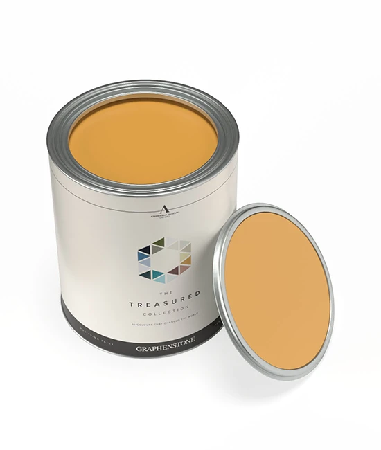
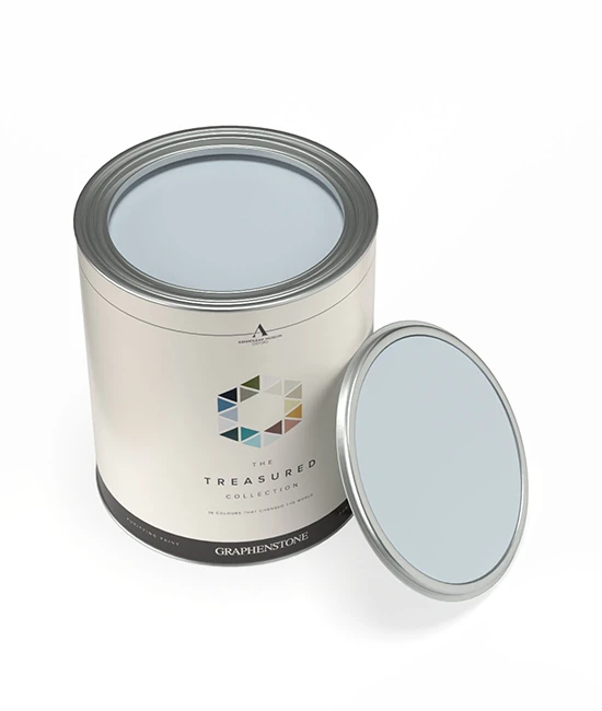
100ml Pot Samples - perfect for testing
Graphenstone Sample Pots are available in our GrafClean Matt finish, offering a smooth, breathable surface with a natural, velvety look. Ideal for testing colours in different lighting and rooms, they give a true representation of the final result using our eco-friendly, mineral-based paint.
| Colour | Colour Description | SELECT ALL | ||
|---|---|---|---|---|
 | ADONIS | This fresh mid-blue, reminiscent of the azure heavens that watched over ancient British landscapes, carries the essence of tranquillity and depth. Its rich heritage makes it ideal for living spaces seeking a touch of serene history when used in low-lit rooms. Adonis sits happily alongside similarly clean Porcelaine and Blue Steel. | £5.50 | |
| This fresh mid-blue, reminiscent of the azure heavens that watched over ancient British landscapes, carries the essence of tranquillity and depth. Its rich heritage makes it ideal for living spaces seeking a touch of serene history when used in low-lit rooms. Adonis sits happily alongside similarly clean Porcelaine and Blue Steel. | ||||
 | ALABASTER | Alabaster, a delicate white softened by grey, echoes the serene beauty of historic statuary. Suggesting a harmonious blend with deep forest greens or rich burgundies, this colour transforms spaces into calm havens reminiscent of English heritage. Alabaster can be used on ceilings and woodwork with cooler greys or as a wall colour for a neutral contemporary space. | £5.50 | |
| Alabaster, a delicate white softened by grey, echoes the serene beauty of historic statuary. Suggesting a harmonious blend with deep forest greens or rich burgundies, this colour transforms spaces into calm havens reminiscent of English heritage. Alabaster can be used on ceilings and woodwork with cooler greys or as a wall colour for a neutral contemporary space. | ||||
 | ALICE’S DRESS LILAC | A soft, dreamy lilac that captures the innocence and curiosity of Alice’s journey. | £5.50 | |
| A soft, dreamy lilac that captures the innocence and curiosity of Alice’s journey. | ||||
 | ALPINE | A subtle off-white reminiscent of mountain mists, infused with a green freshness, Alpine is a very versatile shade just a little softer than Glacier. Ideal for creating serene, light-filled rooms, it pairs beautifully with soft woodland greens or the calming blues of the sea, enhancing spaces with a natural, tranquil vibe. Perfect for living areas and kitchens. | £5.50 | |
| A subtle off-white reminiscent of mountain mists, infused with a green freshness, Alpine is a very versatile shade just a little softer than Glacier. Ideal for creating serene, light-filled rooms, it pairs beautifully with soft woodland greens or the calming blues of the sea, enhancing spaces with a natural, tranquil vibe. Perfect for living areas and kitchens. | ||||
 | AMBER | Inspired by fossilised tree resin, Amber glows with a deep golden warmth, making it ideal for inviting hallways and intimate dining rooms. Pairs beautifully with Warm Magnolia and Pale Hessian. | £5.50 | |
| Inspired by fossilised tree resin, Amber glows with a deep golden warmth, making it ideal for inviting hallways and intimate dining rooms. Pairs beautifully with Warm Magnolia and Pale Hessian. | ||||
 | AMCHOOR | A dusty plaster pink reminiscent of sun-faded frescoes, Amchoor is blended from yellow oxide, black, and red oxide. It is perfect for living spaces or bedrooms seeking a whisper of history and warmth. Amchoor is timeless, creating a wonderful backdrop for antique furniture. In a more contemporary home, it works incredibly well with Mulberry or Wheaten. This colour captures the essence of heritage and comfort and complements modern and traditional interiors with its subtle nod to the past. | £5.50 | |
| A dusty plaster pink reminiscent of sun-faded frescoes, Amchoor is blended from yellow oxide, black, and red oxide. It is perfect for living spaces or bedrooms seeking a whisper of history and warmth. Amchoor is timeless, creating a wonderful backdrop for antique furniture. In a more contemporary home, it works incredibly well with Mulberry or Wheaten. This colour captures the essence of heritage and comfort and complements modern and traditional interiors with its subtle nod to the past. | ||||
 | ANDALUSIAN YELLOW | A warm, golden yellow that reflects the vibrant energy of Andalusia’s sun-drenched landscapes. | £5.50 | |
| A warm, golden yellow that reflects the vibrant energy of Andalusia’s sun-drenched landscapes. | ||||
 | ANGORA | This earthy hue evokes a silky, warm and opulent feel that has been influenced by the richness found in Angora fabric. | £5.50 | |
| This earthy hue evokes a silky, warm and opulent feel that has been influenced by the richness found in Angora fabric. | ||||
 | ANTIQUE PINK | Reminiscent of faded damask fabrics and historic wallpapers, Antique Pink adds depth and romance to interiors. Ideal for pairing with Linen tones and soft neutrals like Pebble Dusk and Carrara White. | £5.50 | |
| Reminiscent of faded damask fabrics and historic wallpapers, Antique Pink adds depth and romance to interiors. Ideal for pairing with Linen tones and soft neutrals like Pebble Dusk and Carrara White. | ||||
 | AQUITANIA OCEAN DAWN | Aquitania Ocean Dawn: Versailles is rich in vibrant colours and this one is neither green nor blue but has an irresistible oceanic feel. | £5.50 | |
| Aquitania Ocean Dawn: Versailles is rich in vibrant colours and this one is neither green nor blue but has an irresistible oceanic feel. | ||||
 | ARCTIC | A fresh mid-blue that mirrors the vast polar skies, Arctic is ideal for bedrooms or bathrooms. Typical of a formal Regency hue, Arctic sits happily alongside similarly clean Porcelaine and Powder Blue. This hue invites a sense of peace and spaciousness, perfect for creating a refreshing sanctuary in your home. | £5.50 | |
| A fresh mid-blue that mirrors the vast polar skies, Arctic is ideal for bedrooms or bathrooms. Typical of a formal Regency hue, Arctic sits happily alongside similarly clean Porcelaine and Powder Blue. This hue invites a sense of peace and spaciousness, perfect for creating a refreshing sanctuary in your home. | ||||
 | ARDENNES | A grey-brown, green-based, mirrors the Ardennes' timeless landscape. Perfect for living rooms or studies, it pairs beautifully with soft creams for a touch of lightness or muted green for natural harmony. It will read greener when used on the walls of underlit rooms and is the perfect accent on furniture when combined with more traditional shades such as Argento. | £5.50 | |
| A grey-brown, green-based, mirrors the Ardennes' timeless landscape. Perfect for living rooms or studies, it pairs beautifully with soft creams for a touch of lightness or muted green for natural harmony. It will read greener when used on the walls of underlit rooms and is the perfect accent on furniture when combined with more traditional shades such as Argento. | ||||
 | ARGENTO | A warm light grey, imbued with the soft glow of morning light, Argento is crafted to evoke a gentle luminescence of silver, adding a tranquil warmth to bedrooms or living spaces. It sits with a lighter off-white and darker grey for a clean and contemporary look but also pairs beautifully with deep blues for a calming effect or warm terracotta for an inviting atmosphere. This versatile shade bridges the gap between modern elegance and the timeless charm of English heritage. | £5.50 | |
| A warm light grey, imbued with the soft glow of morning light, Argento is crafted to evoke a gentle luminescence of silver, adding a tranquil warmth to bedrooms or living spaces. It sits with a lighter off-white and darker grey for a clean and contemporary look but also pairs beautifully with deep blues for a calming effect or warm terracotta for an inviting atmosphere. This versatile shade bridges the gap between modern elegance and the timeless charm of English heritage. | ||||
 | ARTICHOKE | A vibrant green echoes nature's richness and fosters a sense of balance and harmony within the home. It is ideal for living spaces and kitchens. Artichoke is a perfect backdrop for growth, reflection, and renewal areas. It often feels much fresher and brighter in well-lit rooms and when contrasted with a bright white, such as Glacier or White Linen. | £5.50 | |
| A vibrant green echoes nature's richness and fosters a sense of balance and harmony within the home. It is ideal for living spaces and kitchens. Artichoke is a perfect backdrop for growth, reflection, and renewal areas. It often feels much fresher and brighter in well-lit rooms and when contrasted with a bright white, such as Glacier or White Linen. | ||||
| ASHEN | Ashen, a serene grey-based white, evokes the tranquillity of dawn's first light, ideal for spaces of reflection. Its subtle urban feel, drawn from historical mists, suggests pairings with soft pastels or earthy tones, enriching living areas or bedrooms with a peaceful, airy ambience. | £5.50 | |
| Ashen, a serene grey-based white, evokes the tranquillity of dawn's first light, ideal for spaces of reflection. Its subtle urban feel, drawn from historical mists, suggests pairings with soft pastels or earthy tones, enriching living areas or bedrooms with a peaceful, airy ambience. | ||||
 | ASHMOLEAN STONE | The Ashmolean Museum is the world’s first public museum. Its façade is made from cream coloured Bath Stone. | £5.50 | |
| The Ashmolean Museum is the world’s first public museum. Its façade is made from cream coloured Bath Stone. | ||||
 | AUTUMN BARK | Inspired by the rich hues of aged woodlands, Autumn Bark provides depth and contrast in traditional and contemporary settings alike. Pairs effortlessly with Harvest Clay and Faded Lead. | £5.50 | |
| Inspired by the rich hues of aged woodlands, Autumn Bark provides depth and contrast in traditional and contemporary settings alike. Pairs effortlessly with Harvest Clay and Faded Lead. | ||||
 | BALLET SLIPPER | Inspired by the soft silk of a dancer’s shoe, Ballet Slipper lends an air of refinement to interiors, pairing beautifully with Lacewing and Soft Wisteria. | £5.50 | |
| Inspired by the soft silk of a dancer’s shoe, Ballet Slipper lends an air of refinement to interiors, pairing beautifully with Lacewing and Soft Wisteria. | ||||
 | BAROLO | BAROLO – a deep wine colour for Piemonte, the famous wine region, home to Barolo and Nebbiolo. | £5.50 | |
| BAROLO – a deep wine colour for Piemonte, the famous wine region, home to Barolo and Nebbiolo. | ||||
 | BATH STONE | A rich, red-yellow-based tone, inspired by the stone used to face Wrest Park. Inspired by the honeyed hues of Bath’s iconic Georgian buildings, Bath Stone provides a timeless foundation for any space, complementing rich heritage greens and warm neutrals like Notebook and Deal Stairs. | £5.50 | |
| A rich, red-yellow-based tone, inspired by the stone used to face Wrest Park. Inspired by the honeyed hues of Bath’s iconic Georgian buildings, Bath Stone provides a timeless foundation for any space, complementing rich heritage greens and warm neutrals like Notebook and Deal Stairs. | ||||
 | BENGAL | Bengal is a deep mustard yellow that mirrors the warmth and depth of the English countryside's timeless elegance. When contrasted with a light tone like Ivory, it creates a cosy and surprisingly unyellow space. It is to be used in moderation in small rooms. | £5.50 | |
| Bengal is a deep mustard yellow that mirrors the warmth and depth of the English countryside's timeless elegance. When contrasted with a light tone like Ivory, it creates a cosy and surprisingly unyellow space. It is to be used in moderation in small rooms. | ||||
 | BIANCA ITALIA | BIANCA ITALIA – the palest pink that changes from warm cream to a deeper shade depending on the light. Found on some of the downstairs internal doors. | £5.50 | |
| BIANCA ITALIA – the palest pink that changes from warm cream to a deeper shade depending on the light. Found on some of the downstairs internal doors. | ||||
 | BLACKBEAN | A sumptuous, rich, deep, earthy colour, taken from the blackbean veneer used to line the walls of the dramatic entrance hall at Eltham Palace. Evoking the grandeur of lacquered furnishings, Blackbean creates a striking contrast in contemporary interiors. Works beautifully alongside bold accents like Smalt Blue or warm neutrals such as Ironwood. | £5.50 | |
| A sumptuous, rich, deep, earthy colour, taken from the blackbean veneer used to line the walls of the dramatic entrance hall at Eltham Palace. Evoking the grandeur of lacquered furnishings, Blackbean creates a striking contrast in contemporary interiors. Works beautifully alongside bold accents like Smalt Blue or warm neutrals such as Ironwood. | ||||
 | BLEACHED CREAM | A timeless shade, Bleached Cream is perfect for creating soft, harmonious spaces. Ideal for pairing with Traditional Neutrals like Pebble Dusk and Ivory. | £5.50 | |
| A timeless shade, Bleached Cream is perfect for creating soft, harmonious spaces. Ideal for pairing with Traditional Neutrals like Pebble Dusk and Ivory. | ||||
 | BORDEAUX | Bordeaux is a modern crimson evoking the robust vitality of the famed wine, infusing dining rooms or studies with a sense of depth and sophistication. Inspired by the luxurious tapestries of the 17th century, it contains less blue pigment than Carnelian, so it is brighter and more contemporary in feel. | £5.50 | |
| Bordeaux is a modern crimson evoking the robust vitality of the famed wine, infusing dining rooms or studies with a sense of depth and sophistication. Inspired by the luxurious tapestries of the 17th century, it contains less blue pigment than Carnelian, so it is brighter and more contemporary in feel. | ||||
 | BOUCLE | A muted off-white with warm undertones and a hint of cream. Inspired by the richly textured weave of Boucle fabric. | £5.50 | |
| A muted off-white with warm undertones and a hint of cream. Inspired by the richly textured weave of Boucle fabric. | ||||
 | BREAKING WAVE | The art of Japanese woodblock printmaking was a collaborative process between the artist, engraver, printer and publisher. Although Hokusai was the designer of prints published in his name, he was in fact just one of a team of skilled craftsmen responsible for making them. | £5.50 | |
| The art of Japanese woodblock printmaking was a collaborative process between the artist, engraver, printer and publisher. Although Hokusai was the designer of prints published in his name, he was in fact just one of a team of skilled craftsmen responsible for making them. | ||||
| BRIAR ROSE | Briar Rose, blending delicate pink with grey, suits living areas or bedrooms. Perfect with pale blues or rich charcoals, it reflects Victorian elegance, inspiring gentle contemplation and refined grace, creating a space of understated beauty and emotional depth. | £5.50 | |
| Briar Rose, blending delicate pink with grey, suits living areas or bedrooms. Perfect with pale blues or rich charcoals, it reflects Victorian elegance, inspiring gentle contemplation and refined grace, creating a space of understated beauty and emotional depth. | ||||
 | BRUNSWICK | Brunswick, a deep, dark green, channels the majestic essence of centuries-old forests. It is perfect for studies or living rooms seeking a connection with nature's enduring calm. Unless in very well-lit rooms, it appears almost black. Paired with rich browns or muted golds, it creates a space of sophistication and contemplation. This hue is reminiscent of the Georgian period's affinity for nature-inspired interiors. | £5.50 | |
| Brunswick, a deep, dark green, channels the majestic essence of centuries-old forests. It is perfect for studies or living rooms seeking a connection with nature's enduring calm. Unless in very well-lit rooms, it appears almost black. Paired with rich browns or muted golds, it creates a space of sophistication and contemplation. This hue is reminiscent of the Georgian period's affinity for nature-inspired interiors. | ||||
 | BUCKRAM | A foolproof, soft white that will create structure and shape in any room it is put into. | £5.50 | |
| A foolproof, soft white that will create structure and shape in any room it is put into. | ||||
 | BUFF | Buff is a warm and versatile neutral, bringing an understated elegance to interiors. Works well with earthy tones like Warm Stone and Faded Lead. | £5.50 | |
| Buff is a warm and versatile neutral, bringing an understated elegance to interiors. Works well with earthy tones like Warm Stone and Faded Lead. | ||||
| BURNT UMBER | Burnt Umber, a strong grey-brown, green-based, suits living areas or libraries, offering warmth and grounding. It reflects 18th-century earth tone preferences, creating a stable, comforting environment that connects deeply with nature's essence. It will read greener when used on the walls of underlit rooms and is the perfect accent on furniture when combined with more traditional shades such as Ivory or Wheatberry. | £5.50 | |
| Burnt Umber, a strong grey-brown, green-based, suits living areas or libraries, offering warmth and grounding. It reflects 18th-century earth tone preferences, creating a stable, comforting environment that connects deeply with nature's essence. It will read greener when used on the walls of underlit rooms and is the perfect accent on furniture when combined with more traditional shades such as Ivory or Wheatberry. | ||||
 | BUTLER’S GREEN | This traditional, warm green was influenced by scans taken from the service wing at Eltham Palace. A classic shade, Butlers Green brings heritage charm to spaces, pairing well with neutral stone tones like Deal Stairs and warm accents such as Golden Pheasant. | £5.50 | |
| This traditional, warm green was influenced by scans taken from the service wing at Eltham Palace. A classic shade, Butlers Green brings heritage charm to spaces, pairing well with neutral stone tones like Deal Stairs and warm accents such as Golden Pheasant. | ||||
 | CALICO | A colour that emulates simplicity; colour matching the unbleached and undyed calico fabric. This colour is a warm neutral tone with an underlying buttery tint. | £5.50 | |
| A colour that emulates simplicity; colour matching the unbleached and undyed calico fabric. This colour is a warm neutral tone with an underlying buttery tint. | ||||
 | CAMBRIC | Capturing comfort and serenity, working as a perfect base in a scheme; welcoming a layering of textures and colours. | £5.50 | |
| Capturing comfort and serenity, working as a perfect base in a scheme; welcoming a layering of textures and colours. | ||||
 | CAMBRIDGE | Cambridge, a pale and illuminating blue-green, brings the freshness of dawn into spaces like bathrooms or bedrooms. Inspired by the serene elegance of 19th-century academia, this soft and classic tone is ideally suited to children’s bedrooms, especially when contrasted with Oxford on furniture or woodwork. | £5.50 | |
| Cambridge, a pale and illuminating blue-green, brings the freshness of dawn into spaces like bathrooms or bedrooms. Inspired by the serene elegance of 19th-century academia, this soft and classic tone is ideally suited to children’s bedrooms, especially when contrasted with Oxford on furniture or woodwork. | ||||
 | CARMEN’S FLAME | A fiery red-orange, embodying Carmen’s passion and spirit. | £5.50 | |
| A fiery red-orange, embodying Carmen’s passion and spirit. | ||||
 | CARNELIAN | Carnelian is a rich brown burgundy with an aged feel. Paired with creamy neutrals or deep navy, it inspires sophisticated dining experiences. Popular in mid-19th-century dining rooms, it looks almost like a saturated purple compared to the more modern-looking Tuscan Red. | £5.50 | |
| Carnelian is a rich brown burgundy with an aged feel. Paired with creamy neutrals or deep navy, it inspires sophisticated dining experiences. Popular in mid-19th-century dining rooms, it looks almost like a saturated purple compared to the more modern-looking Tuscan Red. | ||||
 | CARRARA WHITE | Perfect for creating a fresh, airy feel, Carrara White pairs beautifully with soft greys and blues like Fjord and Urban Fog. | £5.50 | |
| Perfect for creating a fresh, airy feel, Carrara White pairs beautifully with soft greys and blues like Fjord and Urban Fog. | ||||
 | CASHMERE | As soft and warm as its namesake this pale taupe is rich and enveloping. | £5.50 | |
| As soft and warm as its namesake this pale taupe is rich and enveloping. | ||||
| CASSIUM | Cassium is a subtle off-white with the addition of the smallest amount of warm yellow pigment. It is perfect for living areas, bringing any room a soft, luminous quality. It pairs well with soft pastels or rich jewel tones, creating a versatile backdrop that enhances natural light and space. | £5.50 | |
| Cassium is a subtle off-white with the addition of the smallest amount of warm yellow pigment. It is perfect for living areas, bringing any room a soft, luminous quality. It pairs well with soft pastels or rich jewel tones, creating a versatile backdrop that enhances natural light and space. | ||||
| CELADON | In north-facing rooms, Celadon can read almost as a delicate grey. It is a lighter version of Chateaux, a gentle aqua reminiscent of early spring skies, ideally suited for bathrooms or serene reading nooks. Paired with sandy beiges or soft lavenders, it cultivates a space of renewal and relaxation. | £5.50 | |
| In north-facing rooms, Celadon can read almost as a delicate grey. It is a lighter version of Chateaux, a gentle aqua reminiscent of early spring skies, ideally suited for bathrooms or serene reading nooks. Paired with sandy beiges or soft lavenders, it cultivates a space of renewal and relaxation. | ||||
 | CELESTIAL BLUSH UNSEEN | A strong pink tone based on the 18th century paintings of the prominent French portrait painter, Madame Le Brun. | £5.50 | |
| A strong pink tone based on the 18th century paintings of the prominent French portrait painter, Madame Le Brun. | ||||
 | CERULEAN | Cerulean, a greened navy blue, brings the depth of the night sky into home offices or libraries, promoting focus and creativity. Paired with crisp whites or rich golds, it creates a striking contrast, fostering an environment of sophistication and inspiration. Although traditional in feel, Cerulean is often used as an alternative to Graphene to create a richly dramatic space with a more contemporary finish. | £5.50 | |
| Cerulean, a greened navy blue, brings the depth of the night sky into home offices or libraries, promoting focus and creativity. Paired with crisp whites or rich golds, it creates a striking contrast, fostering an environment of sophistication and inspiration. Although traditional in feel, Cerulean is often used as an alternative to Graphene to create a richly dramatic space with a more contemporary finish. | ||||
 | CHALKHILL BLUE | Chalkhill Blue, a fresh mid-blue typical of a formal Regency hue, is perfect for kitchens or bathrooms. It infuses spaces with the crispness of a bright spring morning. Complemented by soft greys or warm yellows, it creates an uplifting atmosphere that revitalises the spirit. It sits happily alongside similarly clean Cassium and Whisper. | £5.50 | |
| Chalkhill Blue, a fresh mid-blue typical of a formal Regency hue, is perfect for kitchens or bathrooms. It infuses spaces with the crispness of a bright spring morning. Complemented by soft greys or warm yellows, it creates an uplifting atmosphere that revitalises the spirit. It sits happily alongside similarly clean Cassium and Whisper. | ||||
 | CHAMBRAY | A perfect in-between blue shade; this colour is versitile and lightweight; linking to the chambray fabric that it is named after. | £5.50 | |
| A perfect in-between blue shade; this colour is versitile and lightweight; linking to the chambray fabric that it is named after. | ||||
 | CHATEAUX | Chateaux is a fresh aqua hue that is blue-based and soft green. It captures the essence of historic elegance and is suitable for kitchens and dining areas. Pair it with natural wood finishes and soft metallics for a sophisticated, sustainable living environment. | £5.50 | |
| Chateaux is a fresh aqua hue that is blue-based and soft green. It captures the essence of historic elegance and is suitable for kitchens and dining areas. Pair it with natural wood finishes and soft metallics for a sophisticated, sustainable living environment. | ||||
 | CHESTNUT | Chestnut is perfect for traditional and rustic settings, complementing earthy hues like Autumn Bark and Raffia. | £5.50 | |
| Chestnut is perfect for traditional and rustic settings, complementing earthy hues like Autumn Bark and Raffia. | ||||
| CHIFFON | Chiffon, often popular in nurseries, embodies understated elegance. Its soft cream hue enhances bedrooms, creating a restful retreat. Its versatility extends to being an ideal canvas for heritage furniture and contemporary accents. | £5.50 | |
| Chiffon, often popular in nurseries, embodies understated elegance. Its soft cream hue enhances bedrooms, creating a restful retreat. Its versatility extends to being an ideal canvas for heritage furniture and contemporary accents. | ||||
 | CHINESE PORCELAIN | Blue-and-white porcelain made for sale to Japan and Europe used new shapes and pictorial styles. They were often decorated with scenes from popular theatre, novels and legends. | £5.50 | |
| Blue-and-white porcelain made for sale to Japan and Europe used new shapes and pictorial styles. They were often decorated with scenes from popular theatre, novels and legends. | ||||
 | CHINOISERIE | A beautifully soft, light yellow, taken from scans of the Chinese wallpaper at Marble Hill, reimagined by de Gournay for the Dining Parlour in 2006. Chinoiserie pairs beautifully with soft pinks and warm neutrals, adding a subtle yet radiant glow to dining rooms and hallways. Works well alongside Parlour Pink and Ivory. | £5.50 | |
| A beautifully soft, light yellow, taken from scans of the Chinese wallpaper at Marble Hill, reimagined by de Gournay for the Dining Parlour in 2006. Chinoiserie pairs beautifully with soft pinks and warm neutrals, adding a subtle yet radiant glow to dining rooms and hallways. Works well alongside Parlour Pink and Ivory. | ||||
 | CIELO | CIELO – another blue found on a painted ceiling. Reminiscent of summer skies but with a soft tone perfect for our rainwashed climate. | £5.50 | |
| CIELO – another blue found on a painted ceiling. Reminiscent of summer skies but with a soft tone perfect for our rainwashed climate. | ||||
 | CINDERELLA BLUE | A delicate and dreamy light blue that captures the grace and beauty of Cinderella herself, reminiscent of her iconic ballgown. This shade brings calm and sophistication, perfect for tranquil spaces like bedrooms or reading nooks. | £5.50 | |
| A delicate and dreamy light blue that captures the grace and beauty of Cinderella herself, reminiscent of her iconic ballgown. This shade brings calm and sophistication, perfect for tranquil spaces like bedrooms or reading nooks. | ||||
 | CINNABAR | Inspired by the luxurious depths of classic crimson, Cinnabar transforms any bedroom into a haven of warmth and sophistication. It can be used to sumptuous effect in halls when offset with Pebble on woodwork or feel more edgy and graphic when paired with a bright white such as Glacier. Ideal for spaces seeking a touch of heritage with a modern twist, Cinnabar is a testament to an enduring style. | £5.50 | |
| Inspired by the luxurious depths of classic crimson, Cinnabar transforms any bedroom into a haven of warmth and sophistication. It can be used to sumptuous effect in halls when offset with Pebble on woodwork or feel more edgy and graphic when paired with a bright white such as Glacier. Ideal for spaces seeking a touch of heritage with a modern twist, Cinnabar is a testament to an enduring style. | ||||
| CINNAMON | Inspired by the spice, this aged terracotta hue adds warmth and depth, making it suitable for living spaces. Complements sage green and soft cream for a harmonious palette. Perfect for reading rooms or small libraries often found in English stately homes, creating an unapologetically aged feel. | £5.50 | |
| Inspired by the spice, this aged terracotta hue adds warmth and depth, making it suitable for living spaces. Complements sage green and soft cream for a harmonious palette. Perfect for reading rooms or small libraries often found in English stately homes, creating an unapologetically aged feel. | ||||
 | CLOTTED CREAM | This pale creamy white, a yellow-based neutral reminiscent of the luxurious dessert, is perfect for creating a tranquil bedroom or living area atmosphere. It pairs splendidly with dusky pink and soft sage for a gentle, inviting palette. | £5.50 | |
| This pale creamy white, a yellow-based neutral reminiscent of the luxurious dessert, is perfect for creating a tranquil bedroom or living area atmosphere. It pairs splendidly with dusky pink and soft sage for a gentle, inviting palette. | ||||
 | COLLEGE CREAM | J. M. W. Turner knew Oxford well. In the 1830s, Turner felt that his painting of Oxford’s High Street achieved an unparalleled view of technical mastery that he could not repeat. | £5.50 | |
| J. M. W. Turner knew Oxford well. In the 1830s, Turner felt that his painting of Oxford’s High Street achieved an unparalleled view of technical mastery that he could not repeat. | ||||
 | CORDUROY | Corduroy is a classic deep blue. It has depth and can be styled in an endless amount of ways as an accent or as a bold main colour choice. | £5.50 | |
| Corduroy is a classic deep blue. It has depth and can be styled in an endless amount of ways as an accent or as a bold main colour choice. | ||||
 | CORNISH HEARTH | Evoking the hues of ancient clay tiles and hearthstones, Cornish Hearth is ideal for cosy living spaces and rustic kitchens. Pairs beautifully with warm neutrals like Pale Hessian and Notebook. | £5.50 | |
| Evoking the hues of ancient clay tiles and hearthstones, Cornish Hearth is ideal for cosy living spaces and rustic kitchens. Pairs beautifully with warm neutrals like Pale Hessian and Notebook. | ||||
 | COTSWOLD STONE | Cotswold Stone brings warmth and elegance to interiors, creating a seamless blend with natural wood and heritage tones like Deal Stairs and Warm Magnolia. | £5.50 | |
| Cotswold Stone brings warmth and elegance to interiors, creating a seamless blend with natural wood and heritage tones like Deal Stairs and Warm Magnolia. | ||||
 | CREMA | CREMA – the perfect cream that’s warm but not yellow, cool but not grey. | £5.50 | |
| CREMA – the perfect cream that’s warm but not yellow, cool but not grey. | ||||
 | CUMULUS | Cumulus is a perfect neutral for contemporary and traditional interiors alike, pairing harmoniously with Fjord and Whisper. | £5.50 | |
| Cumulus is a perfect neutral for contemporary and traditional interiors alike, pairing harmoniously with Fjord and Whisper. | ||||
 | CYPRESS | Cypress brings a sense of heritage and sophistication, ideal for cozy rooms and snugs. Pairs well with Golden Pheasant and Bath Stone for a refined, natural aesthetic. | £5.50 | |
| Cypress brings a sense of heritage and sophistication, ideal for cozy rooms and snugs. Pairs well with Golden Pheasant and Bath Stone for a refined, natural aesthetic. | ||||
 | DAHLIA | Inspired by the lush petals of heritage dahlias, this colour exudes warmth and vibrancy. Works beautifully alongside warm creams like Kenwood Cream and soft pinks like Antique Pink. | £5.50 | |
| Inspired by the lush petals of heritage dahlias, this colour exudes warmth and vibrancy. Works beautifully alongside warm creams like Kenwood Cream and soft pinks like Antique Pink. | ||||
 | DAMASK | This classic rose pink, inspired by historic elegance, is like traditional roses; it is the perfect colour for creating a dusky feel in a bedroom, promoting a serene and loving atmosphere. Best paired with muted greens and soft whites, creating a space of comfort and gentle energy. To enhance its softness, try using Alabaster on your woodwork. | £5.50 | |
| This classic rose pink, inspired by historic elegance, is like traditional roses; it is the perfect colour for creating a dusky feel in a bedroom, promoting a serene and loving atmosphere. Best paired with muted greens and soft whites, creating a space of comfort and gentle energy. To enhance its softness, try using Alabaster on your woodwork. | ||||
 | DARK FIR 001 | Think depth with natural richness, a base note of the palette. | £5.50 | |
| Think depth with natural richness, a base note of the palette. | ||||
 | DARK NAVY 001 | Crisp yet cool, this is a considered blue hue that grounds and calms. | £5.50 | |
| Crisp yet cool, this is a considered blue hue that grounds and calms. | ||||
 | DARK TURQUOISE 001 | A bright but a deeply sophisticated one so it can be used anywhere. | £5.50 | |
| A bright but a deeply sophisticated one so it can be used anywhere. | ||||
 | DAYDREAM | In 1879 Rossetti was commissioned to paint what was to be his final painting — The Day Dream. This moving black chalk and coloured pastel study was the drawing that inspired it. | £5.50 | |
| In 1879 Rossetti was commissioned to paint what was to be his final painting — The Day Dream. This moving black chalk and coloured pastel study was the drawing that inspired it. | ||||
 | DE GREY | A soft, traditional neutral colour, taken from the fireplace within the light-filled Orangery at Wrest Park, bearing the de Grey coat of arms. De Grey is a refined neutral, perfect for period properties or modern interiors. Pairs beautifully with architectural whites like Carrara White and warm greys like Faded Lead. | £5.50 | |
| A soft, traditional neutral colour, taken from the fireplace within the light-filled Orangery at Wrest Park, bearing the de Grey coat of arms. De Grey is a refined neutral, perfect for period properties or modern interiors. Pairs beautifully with architectural whites like Carrara White and warm greys like Faded Lead. | ||||
 | DEAL STAIRS | A warm stone colour, inspired by scans taken from the decoration of the Deal Stairs at Kenwood. A versatile and grounding hue, Deal Stairs blends seamlessly with traditional creams and earthy hues like Notebook and Warm Stone. | £5.50 | |
| A warm stone colour, inspired by scans taken from the decoration of the Deal Stairs at Kenwood. A versatile and grounding hue, Deal Stairs blends seamlessly with traditional creams and earthy hues like Notebook and Warm Stone. | ||||
 | DELICATE PINK | Delicate Pink is perfect for bedrooms and living spaces, working harmoniously with soft neutrals like Whisper and Ivory. | £5.50 | |
| Delicate Pink is perfect for bedrooms and living spaces, working harmoniously with soft neutrals like Whisper and Ivory. | ||||
 | DENIM | The dominance of Denim instantly creates mood and drama. We love to use this thick and weighty colour as a striking all-over scheme. | £5.50 | |
| The dominance of Denim instantly creates mood and drama. We love to use this thick and weighty colour as a striking all-over scheme. | ||||
 | DIJON | This earthy, yellow-toned neutral, reminiscent of the mustard fields of Dijon, with a green undertone in north-facing rooms, brings warmth and emotional stability to kitchens. It perfectly complements soft greys and rich umbers, creating a comforting and nurturing environment that promotes culinary creativity and familial harmony. | £5.50 | |
| This earthy, yellow-toned neutral, reminiscent of the mustard fields of Dijon, with a green undertone in north-facing rooms, brings warmth and emotional stability to kitchens. It perfectly complements soft greys and rich umbers, creating a comforting and nurturing environment that promotes culinary creativity and familial harmony. | ||||
 | DIRTY BROWNISH 001 | A gloriously rich barely brown that’s full of gentle warmth. | £5.50 | |
| A gloriously rich barely brown that’s full of gentle warmth. | ||||
 | DIRTY LAVENDER 001 | Your warmer, better, more contemporary alternative to grey. | £5.50 | |
| Your warmer, better, more contemporary alternative to grey. | ||||
 | DIRTY ROSE 001 | Your future classic go-anywhere colour to love for a lifetime. | £5.50 | |
| Your future classic go-anywhere colour to love for a lifetime. | ||||
 | DIRTY SAGE 001 | Soft but strong, the perfect base note to every scheme. | £5.50 | |
| Soft but strong, the perfect base note to every scheme. | ||||
 | DON JOSÉ’S GREEN | A deep, mysterious green, symbolising the intensity of Don José’s complex emotions. | £5.50 | |
| A deep, mysterious green, symbolising the intensity of Don José’s complex emotions. | ||||
 | DRESSING ROOM | A bold terracotta, inspired by Lady Mansfield’s dressing room at Kenwood. Dressing Room brings richness and warmth, perfect for traditional interiors or accent spaces. Pairs well with warm neutrals like Bath Stone and Cornish Hearth. | £5.50 | |
| A bold terracotta, inspired by Lady Mansfield’s dressing room at Kenwood. Dressing Room brings richness and warmth, perfect for traditional interiors or accent spaces. Pairs well with warm neutrals like Bath Stone and Cornish Hearth. | ||||
 | DUCK EGG | This pale and illuminating blue, inspired by a duck egg, is perfect for creating a tranquil bedroom or bathroom setting. Paired with crisp whites and soft beiges, it encourages relaxation and mental clarity, fostering a peaceful sanctuary away from the bustling outside world. This smooth and classic tone perfectly suits children’s bedrooms, especially when contrasted with Blue Steel on furniture or woodwork. | £5.50 | |
| This pale and illuminating blue, inspired by a duck egg, is perfect for creating a tranquil bedroom or bathroom setting. Paired with crisp whites and soft beiges, it encourages relaxation and mental clarity, fostering a peaceful sanctuary away from the bustling outside world. This smooth and classic tone perfectly suits children’s bedrooms, especially when contrasted with Blue Steel on furniture or woodwork. | ||||
 | DUSTY SABLE | A muted bred-grey with velvety depth and soft elegance. Warm and sophisticated, it carries a subtle, smoky undertone for a timeless, luxurious feel. Dusty Sable adds an organic, timeless feel to interiors, pairing beautifully with earthy hues like Chestnut and Warm Stone. | £5.50 | |
| A muted bred-grey with velvety depth and soft elegance. Warm and sophisticated, it carries a subtle, smoky undertone for a timeless, luxurious feel. Dusty Sable adds an organic, timeless feel to interiors, pairing beautifully with earthy hues like Chestnut and Warm Stone. | ||||
 | EASY GREEN 001 | Your new neutral: nurturing and evocative, an effortless green. | £5.50 | |
| Your new neutral: nurturing and evocative, an effortless green. | ||||
 | EASY LEMON 001 | An easy mellow yellow to add a kiss of warmth to any surface. | £5.50 | |
| An easy mellow yellow to add a kiss of warmth to any surface. | ||||
 | EASY ROSE 001 | Your second new neutral: warming and gentle, an effortless pink. | £5.50 | |
| Your second new neutral: warming and gentle, an effortless pink. | ||||
| EBONY | Reminiscent of the timeless beauty of nature's darkest hues, Ebony provides a foundation of strength and stability. As with Glacier at the other end of our colour palette, it is easy to understand and indispensable for ironwork, woodwork or even walls. Suited for drawing rooms or studies, it pairs exquisitely with muted greens or vibrant golds, encouraging creativity and a sense of well-being. | £5.50 | |
| Reminiscent of the timeless beauty of nature's darkest hues, Ebony provides a foundation of strength and stability. As with Glacier at the other end of our colour palette, it is easy to understand and indispensable for ironwork, woodwork or even walls. Suited for drawing rooms or studies, it pairs exquisitely with muted greens or vibrant golds, encouraging creativity and a sense of well-being. | ||||
 | ELDORADO | This warm, clean blue was inspired by the 19th-century Zuber wallpaper at Wrest Park. The design, Eldorado, depicts a mythical city representing Africa, Asia, Europe, and America through its flora and fauna. Eldorado balances history with modern elegance, ideal for feature walls or refined interiors. Complements warm neutrals like Notebook and cool blues like Pavilion. | £5.50 | |
| This warm, clean blue was inspired by the 19th-century Zuber wallpaper at Wrest Park. The design, Eldorado, depicts a mythical city representing Africa, Asia, Europe, and America through its flora and fauna. Eldorado balances history with modern elegance, ideal for feature walls or refined interiors. Complements warm neutrals like Notebook and cool blues like Pavilion. | ||||
 | ENAMEL BLUE | Alexis Falize’s cloisonné enamel jewellery caused a sensation when first exhibited at the Paris International Exposition in 1867. Falize’s vivid, jewel-like colours were inspired by Chinese enamels. | £5.50 | |
| Alexis Falize’s cloisonné enamel jewellery caused a sensation when first exhibited at the Paris International Exposition in 1867. Falize’s vivid, jewel-like colours were inspired by Chinese enamels. | ||||
 | ENTRANCE HALL BLUE | A bold, confident blue taking its inspiration from the neoclassical entrance hall at Kenwood, designed by Robert Adam. Perfect for statement spaces, Entrance Hall Blue pairs well with soft whites like Whisper and deeper blues like Smalt Blue. | £5.50 | |
| A bold, confident blue taking its inspiration from the neoclassical entrance hall at Kenwood, designed by Robert Adam. Perfect for statement spaces, Entrance Hall Blue pairs well with soft whites like Whisper and deeper blues like Smalt Blue. | ||||
 | EUCALYPTUS HAZE | Inspired by the National Trust and Heritage buildings, this soft colour is perfect for panelling and doors. | £5.50 | |
| Inspired by the National Trust and Heritage buildings, this soft colour is perfect for panelling and doors. | ||||
 | FADED LEAD | Faded Lead works beautifully in heritage and modern settings alike, pairing effortlessly with Gables Green and Warm Stone. | £5.50 | |
| Faded Lead works beautifully in heritage and modern settings alike, pairing effortlessly with Gables Green and Warm Stone. | ||||
 | FADED PLUM | Faded Plum creates an intimate, sophisticated atmosphere, pairing well with soft pinks like Antique Pink and warm neutrals like Deal Stairs. | £5.50 | |
| Faded Plum creates an intimate, sophisticated atmosphere, pairing well with soft pinks like Antique Pink and warm neutrals like Deal Stairs. | ||||
 | FADED SILK | Perfect for serene interiors, Faded Silk pairs beautifully with architectural neutrals like Carrara White and soft pastels like Ballet Slipper. | £5.50 | |
| Perfect for serene interiors, Faded Silk pairs beautifully with architectural neutrals like Carrara White and soft pastels like Ballet Slipper. | ||||
 | FADED SILK STRAW | An aged parchment colour reflecting the Aubusson freshness, ideal for panelling and walls. | £5.50 | |
| An aged parchment colour reflecting the Aubusson freshness, ideal for panelling and walls. | ||||
 | FAIRY GODMOTHER GREY | A subtle, shimmering grey inspired by the magic and wisdom of the Fairy Godmother, bringing timeless elegance with a modern touch to any space. This versatile colour is ideal for minimalist or contemporary designs. | £5.50 | |
| A subtle, shimmering grey inspired by the magic and wisdom of the Fairy Godmother, bringing timeless elegance with a modern touch to any space. This versatile colour is ideal for minimalist or contemporary designs. | ||||
 | FJORD | Fjord adds depth to interiors while maintaining a calming presence. Pairs well with soft greys like Urban Fog and cool whites like Whisper. | £5.50 | |
| Fjord adds depth to interiors while maintaining a calming presence. Pairs well with soft greys like Urban Fog and cool whites like Whisper. | ||||
 | FLAX | Flax enhances the natural light in any space, complementing earthy tones like Raffia and warm neutrals like Pebble Dusk. | £5.50 | |
| Flax enhances the natural light in any space, complementing earthy tones like Raffia and warm neutrals like Pebble Dusk. | ||||
 | FOREST SLATE | Forest Slate works beautifully in both classic and modern interiors, pairing harmoniously with warm neutrals like Bath Stone and soft greys like Cumulus. | £5.50 | |
| Forest Slate works beautifully in both classic and modern interiors, pairing harmoniously with warm neutrals like Bath Stone and soft greys like Cumulus. | ||||
 | FORGET-ME-NOT | Forget-Me-Not is ideal for bedrooms and living spaces, working beautifully alongside soft whites like Whisper and light blues like Powder Blue. | £5.50 | |
| Forget-Me-Not is ideal for bedrooms and living spaces, working beautifully alongside soft whites like Whisper and light blues like Powder Blue. | ||||
 | FRENCH LAVENDER | French Lavender is ideal for bedrooms and restful spaces, pairing beautifully with warm neutrals like Pebble Dusk and soft blues like Fjord. | £5.50 | |
| French Lavender is ideal for bedrooms and restful spaces, pairing beautifully with warm neutrals like Pebble Dusk and soft blues like Fjord. | ||||
 | FRENCH TRELLIS GREEN | French Trellis Green: First used over 200 years ago for French garden and architectural work across Europe. | £5.50 | |
| French Trellis Green: First used over 200 years ago for French garden and architectural work across Europe. | ||||
 | FROSTED LEAF | Frosted Leaf brings a soothing presence to interiors, pairing well with warm greys like Notebook and neutral greens like Gables Green. | £5.50 | |
| Frosted Leaf brings a soothing presence to interiors, pairing well with warm greys like Notebook and neutral greens like Gables Green. | ||||
 | GABLES GREEN | A rich, dark green inspired by the heavy, luxurious silk damask curtains at Eltham Palace. Gables Green is perfect for feature walls, libraries, or entrance halls, complementing traditional neutrals like Warm Magnolia and earthy tones like Chestnut. | £5.50 | |
| A rich, dark green inspired by the heavy, luxurious silk damask curtains at Eltham Palace. Gables Green is perfect for feature walls, libraries, or entrance halls, complementing traditional neutrals like Warm Magnolia and earthy tones like Chestnut. | ||||
 | GELATO | GELATO – every Italian loves an ice cream and this warm pink is perfect for every room. | £5.50 | |
| GELATO – every Italian loves an ice cream and this warm pink is perfect for every room. | ||||
 | GENOA | Genoa works beautifully in modern and classic interiors, pairing well with muted tones like Soft Sapphire and warm neutrals like Bath Stone. | £5.50 | |
| Genoa works beautifully in modern and classic interiors, pairing well with muted tones like Soft Sapphire and warm neutrals like Bath Stone. | ||||
 | GEORGETTE | As the name suggests, this is a lightweight and delicate colour. A gentle and subtle pink which creates a diffused, flattering light. | £5.50 | |
| As the name suggests, this is a lightweight and delicate colour. A gentle and subtle pink which creates a diffused, flattering light. | ||||
 | GIARDINO | GIARDINO – a soft spring green that echoes the original colour on many of the internal doors of the house. | £5.50 | |
| GIARDINO – a soft spring green that echoes the original colour on many of the internal doors of the house. | ||||
| GLACIER | Evoking the serene majesty of frozen vistas, Glacier white envelops rooms in a cloak of tranquillity and light without the colder blue undertones of a brilliant white. Best suited for living spaces or bedrooms, it pairs seamlessly with Ashen and Suede. Contrast with fresh, strong tones like Burmese and Juniper for a clean, almost graphic finish. | £5.50 | |
| Evoking the serene majesty of frozen vistas, Glacier white envelops rooms in a cloak of tranquillity and light without the colder blue undertones of a brilliant white. Best suited for living spaces or bedrooms, it pairs seamlessly with Ashen and Suede. Contrast with fresh, strong tones like Burmese and Juniper for a clean, almost graphic finish. | ||||
 | GLEMHAM SILK | A deep, red-based brown, inspired by scans of the silk upholstery on furniture at Marble Hill, originally from Glemham Hall in Suffolk. Glemham Silk is ideal for elegant interiors, pairing beautifully with warm neutrals like Deal Stairs and soft reds like Dahlia. | £5.50 | |
| A deep, red-based brown, inspired by scans of the silk upholstery on furniture at Marble Hill, originally from Glemham Hall in Suffolk. Glemham Silk is ideal for elegant interiors, pairing beautifully with warm neutrals like Deal Stairs and soft reds like Dahlia. | ||||
 | GOLDEN PHEASANT | A rich, warm yellow named after imagery depicted in the wallpapers of the bedroom suites at Wrest Park. Golden Pheasant is perfect for welcoming spaces like hallways or kitchens, pairing well with soft greens like The Map Room and warm neutrals like Pale Hessian. | £5.50 | |
| A rich, warm yellow named after imagery depicted in the wallpapers of the bedroom suites at Wrest Park. Golden Pheasant is perfect for welcoming spaces like hallways or kitchens, pairing well with soft greens like The Map Room and warm neutrals like Pale Hessian. | ||||
 | GOSSAMER | Gossamer, an evocative pale blue that captures the essence of the early morning's first light, is ideal for nurseries or sunrooms. This soft and classic tone perfectly suits children’s bedrooms, especially when contrasted with Oxford on furniture or woodwork. | £5.50 | |
| Gossamer, an evocative pale blue that captures the essence of the early morning's first light, is ideal for nurseries or sunrooms. This soft and classic tone perfectly suits children’s bedrooms, especially when contrasted with Oxford on furniture or woodwork. | ||||
 | GRAPE | Grape, a dark and sophisticated lavender, draws upon the heritage of 19th-century parlours, offering a tranquil retreat. Ideal for bedrooms, its depth pairs well with antique golds and rich creams, inviting a sense of historical luxury and modern comfort. This colour celebrates the past while creating a nurturing space for reflection and repose. It is often combined with Linwood and Ashen for a rich, contemporary feel. | £5.50 | |
| Grape, a dark and sophisticated lavender, draws upon the heritage of 19th-century parlours, offering a tranquil retreat. Ideal for bedrooms, its depth pairs well with antique golds and rich creams, inviting a sense of historical luxury and modern comfort. This colour celebrates the past while creating a nurturing space for reflection and repose. It is often combined with Linwood and Ashen for a rich, contemporary feel. | ||||
 | GRAPHENE | Graphene is more blue than black and is a softer alternative to black. Evocative of the early Victorian era's fascination with the unseen world, Graphene’s soft black with subtle blue undertones brings depth and sophistication to drawing rooms. Paired with muted golds or rich ivories, it creates a space that is both intimate and expansive. This colour resonates with history's shadows, offering a canvas for quiet reflection and spirited discourse. It becomes much more relaxed in feel in an eggshell finish. | £5.50 | |
| Graphene is more blue than black and is a softer alternative to black. Evocative of the early Victorian era's fascination with the unseen world, Graphene’s soft black with subtle blue undertones brings depth and sophistication to drawing rooms. Paired with muted golds or rich ivories, it creates a space that is both intimate and expansive. This colour resonates with history's shadows, offering a canvas for quiet reflection and spirited discourse. It becomes much more relaxed in feel in an eggshell finish. | ||||
 | GREY GOOSE | This gentle blue-grey hue, reminiscent of the softest goose down, brings a peaceful ambience to any room. Paired with crisp whites or soft greys, it creates an airy and anchored space. This smooth and classic tone perfectly suits children’s bedrooms, especially when contrasted with Grape on furniture or woodwork. | £5.50 | |
| This gentle blue-grey hue, reminiscent of the softest goose down, brings a peaceful ambience to any room. Paired with crisp whites or soft greys, it creates an airy and anchored space. This smooth and classic tone perfectly suits children’s bedrooms, especially when contrasted with Grape on furniture or woodwork. | ||||
 | GROSGRAIN | As the name suggests this soft green is a perfect "trim" or accent as well as being a versitile background. The muted green creates a calm and cool interior. | £5.50 | |
| As the name suggests this soft green is a perfect "trim" or accent as well as being a versitile background. The muted green creates a calm and cool interior. | ||||
 | GYPSUM | Gypsum enhances light-filled interiors, working beautifully alongside warm tones like Warm Magnolia and soft greys like Urban Fog. | £5.50 | |
| Gypsum enhances light-filled interiors, working beautifully alongside warm tones like Warm Magnolia and soft greys like Urban Fog. | ||||
 | HARVEST CLAY | Harvest Clay is ideal for feature walls, dining spaces, or exteriors, pairing well with warm neutrals like Raffia and soft reds like Dressing Room. | £5.50 | |
| Harvest Clay is ideal for feature walls, dining spaces, or exteriors, pairing well with warm neutrals like Raffia and soft reds like Dressing Room. | ||||
 | HERRINGBONE | This serene green is named after the refined woven herringbone fabric which, like the paint colour can be styled in any number of ways. | £5.50 | |
| This serene green is named after the refined woven herringbone fabric which, like the paint colour can be styled in any number of ways. | ||||
 | HESSIAN | A mid-tone taupe that opens up a sophisticated and versitile colour palette. This contemporary colour relates to the fabric that it is named after; suggesting modern elegance and style. | £5.50 | |
| A mid-tone taupe that opens up a sophisticated and versitile colour palette. This contemporary colour relates to the fabric that it is named after; suggesting modern elegance and style. | ||||
 | HIGHLAND | Reminiscent of the Highlands, this colour was popular in interiors during the late 19th century. This smoky green brings depth and introspection to dining areas. Harmonising with rustic oranges and deep browns, it fosters a space where old stories are shared over hearty feasts, connecting the present with the ancestral past. | £5.50 | |
| Reminiscent of the Highlands, this colour was popular in interiors during the late 19th century. This smoky green brings depth and introspection to dining areas. Harmonising with rustic oranges and deep browns, it fosters a space where old stories are shared over hearty feasts, connecting the present with the ancestral past. | ||||
 | HINT OF LILAC | Hint of Lilac is perfect for bedrooms and relaxing spaces, pairing well with warm neutrals like Notebook and soft pinks like Ballet Slipper. | £5.50 | |
| Hint of Lilac is perfect for bedrooms and relaxing spaces, pairing well with warm neutrals like Notebook and soft pinks like Ballet Slipper. | ||||
 | ICEBERG | Reflecting the pristine beauty of its namesake, Iceberg's faint blue essence transforms kitchens into spaces of clarity and calm. Combined with natural stone and pale wood accents, it evokes the tranquil expanses of the Arctic. Drawing on the untouched purity of 18th-century explorations, this colour offers a haven of serenity in the home. Iceberg comes into its own when contrasted with Glacier. | £5.50 | |
| Reflecting the pristine beauty of its namesake, Iceberg's faint blue essence transforms kitchens into spaces of clarity and calm. Combined with natural stone and pale wood accents, it evokes the tranquil expanses of the Arctic. Drawing on the untouched purity of 18th-century explorations, this colour offers a haven of serenity in the home. Iceberg comes into its own when contrasted with Glacier. | ||||
 | ICED SKY | Iced Sky works well in contemporary and classic spaces, pairing beautifully with soft whites like Carrara White and muted blues like Fjord. | £5.50 | |
| Iced Sky works well in contemporary and classic spaces, pairing beautifully with soft whites like Carrara White and muted blues like Fjord. | ||||
 | IMPERIAL | The brilliant cloisonné artist Namikawa Yasuyuki of Kyoto, was one of the most celebrated enamellers of his day. This beautiful waterfall vase was made shortly before his retirement in 1915, when he was at the peak of his achievements. | £5.50 | |
| The brilliant cloisonné artist Namikawa Yasuyuki of Kyoto, was one of the most celebrated enamellers of his day. This beautiful waterfall vase was made shortly before his retirement in 1915, when he was at the peak of his achievements. | ||||
 | INDIAN TERRACOTTA | Terracotta has been an important and expressive medium for sculpture in India for millennia. It is often used, for example, to fashion religious icons, votive objects and toys. This goddess was discovered in 1883. | £5.50 | |
| Terracotta has been an important and expressive medium for sculpture in India for millennia. It is often used, for example, to fashion religious icons, votive objects and toys. This goddess was discovered in 1883. | ||||
 | INDIGO | Indigo, with its rich, dark grey depths, brings sophistication and introspection to living spaces. Drawing from the 17th-century fascination with the cosmos, this colour invites reflection and conversation, making spaces both expansive and intimate. It will appear much bluer when used in well-lit home areas, working wonderfully when contrasted with Juniper. | £5.50 | |
| Indigo, with its rich, dark grey depths, brings sophistication and introspection to living spaces. Drawing from the 17th-century fascination with the cosmos, this colour invites reflection and conversation, making spaces both expansive and intimate. It will appear much bluer when used in well-lit home areas, working wonderfully when contrasted with Juniper. | ||||
 | INNER SHELL PINK | A pink that echoes the delicacy and vibrancy of Aubusson rugs without being overwhelming, a soft colour like the inside of a Conch shell. | £5.50 | |
| A pink that echoes the delicacy and vibrancy of Aubusson rugs without being overwhelming, a soft colour like the inside of a Conch shell. | ||||
 | IRIS | IRIS – a deep blue – less purple than the flower – but found on the fresco’ed ceiling in one of the bedrooms. | £5.50 | |
| IRIS – a deep blue – less purple than the flower – but found on the fresco’ed ceiling in one of the bedrooms. | ||||
 | IRONWOOD | Ironwood is perfect for creating cosy, intimate spaces, pairing well with earthy tones like Warm Stone and rich reds like Red Damask. | £5.50 | |
| Ironwood is perfect for creating cosy, intimate spaces, pairing well with earthy tones like Warm Stone and rich reds like Red Damask. | ||||
| IVORY | Ivory reflects the understated elegance of 18th-century rooms and offers a backdrop of warmth and light. Ideal for communal areas to foster openness and friendliness, it complements rich greens and deep blues, creating a delicate balance between refinement and welcoming ease. | £5.50 | |
| Ivory reflects the understated elegance of 18th-century rooms and offers a backdrop of warmth and light. Ideal for communal areas to foster openness and friendliness, it complements rich greens and deep blues, creating a delicate balance between refinement and welcoming ease. | ||||
 | JAIPUR | Jaipur, a zestful mint green, captures the essence of historic gardens and offers an invigorating presence in living rooms. Its vivid mint colour makes it feel just as at home on contemporary kitchen cabinets, especially when paired with Indigo, as it does on the walls of a 19th-century dining room. | £5.50 | |
| Jaipur, a zestful mint green, captures the essence of historic gardens and offers an invigorating presence in living rooms. Its vivid mint colour makes it feel just as at home on contemporary kitchen cabinets, especially when paired with Indigo, as it does on the walls of a 19th-century dining room. | ||||
 | JASMINE | Jasmine is a versatile neutral, ideal for all interiors, working beautifully with warm greys like Notebook and soft yellows like Golden Pheasant. | £5.50 | |
| Jasmine is a versatile neutral, ideal for all interiors, working beautifully with warm greys like Notebook and soft yellows like Golden Pheasant. | ||||
 | JULIET’S BALCONY BEIGE | A romantic, soft beige, inspired by the setting of Juliet’s famous balcony. | £5.50 | |
| A romantic, soft beige, inspired by the setting of Juliet’s famous balcony. | ||||
 | JUNIPER | Reminiscent of 17th-century wood panelling, Juniper's dark, rich brown brings timeless elegance to home libraries. It harmonises with muted greens and burnished golds, offering a sanctuary for contemplation and leisure. This colour speaks to the soul's desire for connection to nature and history. Often used with Briar Rose to enhance historic art and antique furniture. | £5.50 | |
| Reminiscent of 17th-century wood panelling, Juniper's dark, rich brown brings timeless elegance to home libraries. It harmonises with muted greens and burnished golds, offering a sanctuary for contemplation and leisure. This colour speaks to the soul's desire for connection to nature and history. Often used with Briar Rose to enhance historic art and antique furniture. | ||||
 | KENWOOD CREAM | A light, traditional cream, inspired by the graceful Georgian exterior of Kenwood. Kenwood Cream is ideal for period properties, blending seamlessly with warm neutrals like Bath Stone and soft pinks like Parlour Pink. | £5.50 | |
| A light, traditional cream, inspired by the graceful Georgian exterior of Kenwood. Kenwood Cream is ideal for period properties, blending seamlessly with warm neutrals like Bath Stone and soft pinks like Parlour Pink. | ||||
 | KINGFISHER | Close examination of this rightly celebrated drawing by John Ruskin reveals that it is less finely detailed than at first appears — the feathers, for example, are indicated more by colour than by precise shape. | £5.50 | |
| Close examination of this rightly celebrated drawing by John Ruskin reveals that it is less finely detailed than at first appears — the feathers, for example, are indicated more by colour than by precise shape. | ||||
 | KOMBU | A sage hue, a cleaned version of Brunswick, echoing the serene essence of 18th-century walled gardens, Kombu infuses dining rooms with calm and continuity. When complemented by rustic oranges and deep browns, it cultivates an environment where meals are savoured and conversation flows freely. It is best used either on its own on both walls and woodwork or with a darker neutral like Old Bone to enhance its deep sage notes. | £5.50 | |
| A sage hue, a cleaned version of Brunswick, echoing the serene essence of 18th-century walled gardens, Kombu infuses dining rooms with calm and continuity. When complemented by rustic oranges and deep browns, it cultivates an environment where meals are savoured and conversation flows freely. It is best used either on its own on both walls and woodwork or with a darker neutral like Old Bone to enhance its deep sage notes. | ||||
 | LA COMMANDERIE RED | A vibrant and warm colour inspired by Tim’s Chateau interior, ideal for a study or dining room. | £5.50 | |
| A vibrant and warm colour inspired by Tim’s Chateau interior, ideal for a study or dining room. | ||||
 | LACEWING | A muted rose red, inspired by wallpaper scans at Marble Hill. Named after the red lacewing butterfly, native to South and Southeast Asia. Lacewing is a striking choice for feature walls and accent spaces, pairing well with warm neutrals like Pale Hessian and soft creams like Chinoiserie. | £5.50 | |
| A muted rose red, inspired by wallpaper scans at Marble Hill. Named after the red lacewing butterfly, native to South and Southeast Asia. Lacewing is a striking choice for feature walls and accent spaces, pairing well with warm neutrals like Pale Hessian and soft creams like Chinoiserie. | ||||
| LATTE | Reminiscent of the soft hues found in 19th-century countryside estates, Latte's understated elegance enhances the home office's decor. Red-based, paired with sage greens and dusky pinks, fosters a focus and creativity space. It can be combined with Miso or Dijon to read pinker or with the darker Burnt Umber on woodwork for a slightly aged look and relaxed feel. | £5.50 | |
| Reminiscent of the soft hues found in 19th-century countryside estates, Latte's understated elegance enhances the home office's decor. Red-based, paired with sage greens and dusky pinks, fosters a focus and creativity space. It can be combined with Miso or Dijon to read pinker or with the darker Burnt Umber on woodwork for a slightly aged look and relaxed feel. | ||||
 | LAVANDA | LAVANDA – a soft lilac colour that perfectly compliments the 100-year-old wisteria growing round the garden. | £5.50 | |
| LAVANDA – a soft lilac colour that perfectly compliments the 100-year-old wisteria growing round the garden. | ||||
 | LINWOOD | Drawing inspiration from the mist-covered landscapes of early 19th-century paintings, Linwood offers a backdrop of gentle serenity for bedrooms. Accented with deep forest greens and warm ambers, it creates a nurturing haven that encourages rest and rejuvenation. A modern neutral, it sits with the lighter Alabaster and Otter for a clean and contemporary look but can also be used in a darker statement scheme alongside Burmese. | £5.50 | |
| Drawing inspiration from the mist-covered landscapes of early 19th-century paintings, Linwood offers a backdrop of gentle serenity for bedrooms. Accented with deep forest greens and warm ambers, it creates a nurturing haven that encourages rest and rejuvenation. A modern neutral, it sits with the lighter Alabaster and Otter for a clean and contemporary look but can also be used in a darker statement scheme alongside Burmese. | ||||
 | LODEN | Loden is a deep green colour with teal undertones. This bold colour brings incredible impact and will ground any scheme. | £5.50 | |
| Loden is a deep green colour with teal undertones. This bold colour brings incredible impact and will ground any scheme. | ||||
 | LONDON EVENING | London Evening works beautifully in formal dining rooms or cosy bedrooms, pairing well with muted blues like Pavilion and soft greys like Urban Fog. | £5.50 | |
| London Evening works beautifully in formal dining rooms or cosy bedrooms, pairing well with muted blues like Pavilion and soft greys like Urban Fog. | ||||
| LOVAT | Inspired by the stately homes of the 18th century, Lovat brings an element of classic sophistication to living areas. Less green than Ardennes and with an unsurpassed depth of colour, Lovat’s rich and chalky hue sits just as well in a contemporary room as in a historic house. This colour encourages a contemplative mood, perfect for spaces dedicated to relaxation and thoughtful engagement with the world. | £5.50 | |
| Inspired by the stately homes of the 18th century, Lovat brings an element of classic sophistication to living areas. Less green than Ardennes and with an unsurpassed depth of colour, Lovat’s rich and chalky hue sits just as well in a contemporary room as in a historic house. This colour encourages a contemplative mood, perfect for spaces dedicated to relaxation and thoughtful engagement with the world. | ||||
 | LOVE’S BLUSH PINK | A tender, gentle pink that reflects the innocence and passion of young love. | £5.50 | |
| A tender, gentle pink that reflects the innocence and passion of young love. | ||||
 | LUCKSTONE | Luckstone is perfect for creating a calming atmosphere, pairing beautifully with earthy tones like Mocha and warm neutrals like Notebook. | £5.50 | |
| Luckstone is perfect for creating a calming atmosphere, pairing beautifully with earthy tones like Mocha and warm neutrals like Notebook. | ||||
 | MADAME POMPADOURS TAFFETA | A unique colour inspired by Madame de Pompadour, a Member of the French court and the subject of many paintings. | £5.50 | |
| A unique colour inspired by Madame de Pompadour, a Member of the French court and the subject of many paintings. | ||||
 | MAH-JONGG | A warm grey inspired by a beloved pet lemur Mah-Jongg, who was bought from Harrods by the Courtauld’s in the 1920s and lived a life of luxury at Eltham Palace. Mah-Jongg is a sophisticated choice for heritage and modern interiors alike, pairing well with muted greens like The Map Room and warm neutrals like Warm Magnolia. | £5.50 | |
| A warm grey inspired by a beloved pet lemur Mah-Jongg, who was bought from Harrods by the Courtauld’s in the 1920s and lived a life of luxury at Eltham Palace. Mah-Jongg is a sophisticated choice for heritage and modern interiors alike, pairing well with muted greens like The Map Room and warm neutrals like Warm Magnolia. | ||||
 | MANSFIELD’S BLUE | A sophisticated, green-toned blue inspired by Lord Mansfield’s bedchamber at Kenwood. William Murray, who went on to become the 1st Earl of Mansfield, bought the house in 1754. Mansfield’s Blue is a perfect choice for study spaces or period properties, working beautifully with muted blues like Smalt Blue and soft creams like Kenwood Cream. | £5.50 | |
| A sophisticated, green-toned blue inspired by Lord Mansfield’s bedchamber at Kenwood. William Murray, who went on to become the 1st Earl of Mansfield, bought the house in 1754. Mansfield’s Blue is a perfect choice for study spaces or period properties, working beautifully with muted blues like Smalt Blue and soft creams like Kenwood Cream. | ||||
 | MAPLE | A soft, natural gold, taken from the bird’s-eye maple veneer that lines the walls of the dining room at Eltham Palace. Maple adds a refined touch to interiors, pairing well with warm yellows like Golden Pheasant and earthy tones like Harvest Clay. | £5.50 | |
| A soft, natural gold, taken from the bird’s-eye maple veneer that lines the walls of the dining room at Eltham Palace. Maple adds a refined touch to interiors, pairing well with warm yellows like Golden Pheasant and earthy tones like Harvest Clay. | ||||
 | MARBLE WHITE | A beautiful Ideal Head bust by sculptor Antonio Canova. A quintessential example of his masterly interpretation of the Antique in a vision of pure, serene perfection | £5.50 | |
| A beautiful Ideal Head bust by sculptor Antonio Canova. A quintessential example of his masterly interpretation of the Antique in a vision of pure, serene perfection | ||||
 | MAYAN BLUE | Mayan Blue is perfect for bold, elegant interiors, working beautifully with soft neutrals like Pale Hessian and muted greens like The Map Room. | £5.50 | |
| Mayan Blue is perfect for bold, elegant interiors, working beautifully with soft neutrals like Pale Hessian and muted greens like The Map Room. | ||||
 | MERINO | This faded terracotta stone shade offers the luxury that the Merino wool has as a fibre but in paint form. This muted hue can create both airy and cozy spaces, depending on its pairings. | £5.50 | |
| This faded terracotta stone shade offers the luxury that the Merino wool has as a fibre but in paint form. This muted hue can create both airy and cozy spaces, depending on its pairings. | ||||
 | MESSIAH | Antonio Stradivari created violins which have been much imitated and are still the most revered instruments to many players. This example is called the “Messiah”, possibly the finest violin in the world. | £5.50 | |
| Antonio Stradivari created violins which have been much imitated and are still the most revered instruments to many players. This example is called the “Messiah”, possibly the finest violin in the world. | ||||
 | MID SAND | Mid Sand is ideal for creating a welcoming interior, pairing beautifully with earthy tones like Harvest Clay and muted creams like Kenwood Cream. | £5.50 | |
| Mid Sand is ideal for creating a welcoming interior, pairing beautifully with earthy tones like Harvest Clay and muted creams like Kenwood Cream. | ||||
 | MINERAL | These small sealstones were used as jewellery by both men and women. From the pictures on them we learn about the iconography, performance, flora, art, craft and technology of the Bronze age Aegean. | £5.50 | |
| These small sealstones were used as jewellery by both men and women. From the pictures on them we learn about the iconography, performance, flora, art, craft and technology of the Bronze age Aegean. | ||||
 | MINK | Echoing the luxurious textiles of the Victorian era, Mink infuses spaces with warmth and sophistication. Ideal for bedrooms, it creates a welcoming first impression when matched with dark greens and rich gold, offering a modern take on traditional luxury. Pair with Stone for the most flattering and subtle scheme. | £5.50 | |
| Echoing the luxurious textiles of the Victorian era, Mink infuses spaces with warmth and sophistication. Ideal for bedrooms, it creates a welcoming first impression when matched with dark greens and rich gold, offering a modern take on traditional luxury. Pair with Stone for the most flattering and subtle scheme. | ||||
 | MISO | Miso, a serene grey-brown with a red-based tone, draws inspiration from the tranquil retreats of 18th-century monasteries, offering a soothing presence in bedrooms. It will read greener when used on the walls of underlit rooms and is the perfect accent on furniture when combined with more traditional shades such as Alabaster or Clotted Cream. | £5.50 | |
| Miso, a serene grey-brown with a red-based tone, draws inspiration from the tranquil retreats of 18th-century monasteries, offering a soothing presence in bedrooms. It will read greener when used on the walls of underlit rooms and is the perfect accent on furniture when combined with more traditional shades such as Alabaster or Clotted Cream. | ||||
| MIST | Inspired by the early morning fog over 18th-century English landscapes. Mist appears to be a very pale lilac when contrasted with our Glacier, making it perfect for children’s bedrooms when wanting to keep a neutral scheme. This colour invites introspection and a deep connection to nature's serene and ephemeral beauty. | £5.50 | |
| Inspired by the early morning fog over 18th-century English landscapes. Mist appears to be a very pale lilac when contrasted with our Glacier, making it perfect for children’s bedrooms when wanting to keep a neutral scheme. This colour invites introspection and a deep connection to nature's serene and ephemeral beauty. | ||||
 | MOCHA | Mocha works well in cosy living rooms or heritage spaces, complementing warm neutrals like Raffia and soft reds like Parlour Pink. | £5.50 | |
| Mocha works well in cosy living rooms or heritage spaces, complementing warm neutrals like Raffia and soft reds like Parlour Pink. | ||||
 | MOHAIR | This colour reads luxury and elegance with the colour's depth mirroring the warn tan tones found in the natural Mohair fibre. | £5.50 | |
| This colour reads luxury and elegance with the colour's depth mirroring the warn tan tones found in the natural Mohair fibre. | ||||
 | MOIRE | Moire has a silky and smooth appearance that is gentle and calming. Its subtle purple tones work well in classic or contempoary interiors | £5.50 | |
| Moire has a silky and smooth appearance that is gentle and calming. Its subtle purple tones work well in classic or contempoary interiors | ||||
 | MOLESKIN | A warm and muted brown grey, used in the opulent interiors of 19th-century drawing rooms, is trendy in modern living rooms. Moleskin provides a backdrop of stately elegance for dining areas. It is the perfect accent colour for all the warm neutral colours or can be used on woodwork with rich Juniper. | £5.50 | |
| A warm and muted brown grey, used in the opulent interiors of 19th-century drawing rooms, is trendy in modern living rooms. Moleskin provides a backdrop of stately elegance for dining areas. It is the perfect accent colour for all the warm neutral colours or can be used on woodwork with rich Juniper. | ||||
 | MOONLIT SLIPPER | A soft, luminous off-white that evokes the gentle glow of Cinderella’s glass slipper under the moonlight, perfect for creating a serene, ethereal atmosphere in any room. | £5.50 | |
| A soft, luminous off-white that evokes the gentle glow of Cinderella’s glass slipper under the moonlight, perfect for creating a serene, ethereal atmosphere in any room. | ||||
 | MUDLARKING | Mudlarking is a striking backdrop for modern or period interiors, pairing well with soft neutrals like Pebble Dusk and muted blues like Pavilion. | £5.50 | |
| Mudlarking is a striking backdrop for modern or period interiors, pairing well with soft neutrals like Pebble Dusk and muted blues like Pavilion. | ||||
 | MULBERRY | Drawing from the regal elegance of Victorian salons, Mulberry transforms living areas into spaces of sophisticated conversation and reflection. It can create a warm and highly refined finish on all walls but is often used as a feature wall to enhance a neutral Pale Walnut scheme or as an accent on the underside of a bath or kitchen island. | £5.50 | |
| Drawing from the regal elegance of Victorian salons, Mulberry transforms living areas into spaces of sophisticated conversation and reflection. It can create a warm and highly refined finish on all walls but is often used as a feature wall to enhance a neutral Pale Walnut scheme or as an accent on the underside of a bath or kitchen island. | ||||
 | MULBERRY SILK | This colour holds the quality and continuity of Mulberry Silk and is a gorgeous rich colour. This colour has endless opportunitys and creates a beautiful harmonious atmosphere. | £5.50 | |
| This colour holds the quality and continuity of Mulberry Silk and is a gorgeous rich colour. This colour has endless opportunitys and creates a beautiful harmonious atmosphere. | ||||
 | MUSTARD 001 | A dash of the unexpected, your requisite touch of spice. | £5.50 | |
| A dash of the unexpected, your requisite touch of spice. | ||||
 | NAKAJIMA | Inspired by the peaceful retreats of Japanese gardens, Nakajima's subdued blue-green offers a contemplative backdrop for living rooms. When complemented by rich woods and soft beiges, it fosters a harmonious environment that encourages relaxation and mindfulness. Very cheerful and welcoming, it is a great favourite for kitchens. | £5.50 | |
| Inspired by the peaceful retreats of Japanese gardens, Nakajima's subdued blue-green offers a contemplative backdrop for living rooms. When complemented by rich woods and soft beiges, it fosters a harmonious environment that encourages relaxation and mindfulness. Very cheerful and welcoming, it is a great favourite for kitchens. | ||||
 | NAPLES YELLOW | Naples Yellow is a timeless choice for kitchens and sitting rooms, working beautifully with warm greys like Notebook and muted greens like Butler’s Green. | £5.50 | |
| Naples Yellow is a timeless choice for kitchens and sitting rooms, working beautifully with warm greys like Notebook and muted greens like Butler’s Green. | ||||
 | NORFOLK FRET | Norfolk Fret is perfect for period interiors, pairing well with soft creams like Bleached Cream and muted blues like Wedgewood Blue. | £5.50 | |
| Norfolk Fret is perfect for period interiors, pairing well with soft creams like Bleached Cream and muted blues like Wedgewood Blue. | ||||
 | NOTEBOOK | A warm grey-green, taken from the dining room at Eltham Palace, inspired by the notebook that Virginia Courtauld used to offer feedback to the kitchen after dinner parties. Notebook is a refined choice for study spaces or living areas, working well with soft neutrals like Bath Stone and muted greens like The Map Room. | £5.50 | |
| A warm grey-green, taken from the dining room at Eltham Palace, inspired by the notebook that Virginia Courtauld used to offer feedback to the kitchen after dinner parties. Notebook is a refined choice for study spaces or living areas, working well with soft neutrals like Bath Stone and muted greens like The Map Room. | ||||
 | OCEAN | Echoing the boundless energy of the sea, Ocean infuses dining rooms with a dynamic, uplifting atmosphere. Complemented by warm yellows and crisp whites, it creates a lively space for gatherings, where meals are enjoyed against spirited conversation. This colour, reminiscent of 18th-century seascapes, invites the same sense of exploration and wonder, making every moment at home an opportunity for discovery and joy. | £5.50 | |
| Echoing the boundless energy of the sea, Ocean infuses dining rooms with a dynamic, uplifting atmosphere. Complemented by warm yellows and crisp whites, it creates a lively space for gatherings, where meals are enjoyed against spirited conversation. This colour, reminiscent of 18th-century seascapes, invites the same sense of exploration and wonder, making every moment at home an opportunity for discovery and joy. | ||||
| OLD BONE | Reminiscent of the architectural grandeur of Georgian estates, Old Bone's traditional grey lends a dignified air to entrance halls. Less blue than Truffle and with an unsurpassed depth of colour, it is a rich and chalky hue that sits just as well in a contemporary room as in a historic house. | £5.50 | |
| Reminiscent of the architectural grandeur of Georgian estates, Old Bone's traditional grey lends a dignified air to entrance halls. Less blue than Truffle and with an unsurpassed depth of colour, it is a rich and chalky hue that sits just as well in a contemporary room as in a historic house. | ||||
 | OLD LILAC | Drawing inspiration from the ornamental gardens of the 19th century, Old Lilac brings gentle warmth to dining areas. It is the perfect colour for creating a dusky feel in a bedroom and is also much favoured in garden rooms when paired with complementary Truffle or Old Bone. To enhance its softness, try using White Pepper on your woodwork. | £5.50 | |
| Drawing inspiration from the ornamental gardens of the 19th century, Old Lilac brings gentle warmth to dining areas. It is the perfect colour for creating a dusky feel in a bedroom and is also much favoured in garden rooms when paired with complementary Truffle or Old Bone. To enhance its softness, try using White Pepper on your woodwork. | ||||
 | OLIVA | OLIVA – this olive green was found on several of the internal doors. | £5.50 | |
| OLIVA – this olive green was found on several of the internal doors. | ||||
 | OLIVE | Echoing the lush landscapes of the English countryside, Olive offers a serene backdrop for studies, encouraging concentration and creativity. It looks most at home when paired with a traditional neutral such as Ashen or Argento. | £5.50 | |
| Echoing the lush landscapes of the English countryside, Olive offers a serene backdrop for studies, encouraging concentration and creativity. It looks most at home when paired with a traditional neutral such as Ashen or Argento. | ||||
 | ONE SHADE OF GREY | The perfect and only shade of grey, featuring a delightful and unusual purple hue. Very contemporary for interiors of the future. | £5.50 | |
| The perfect and only shade of grey, featuring a delightful and unusual purple hue. Very contemporary for interiors of the future. | ||||
 | ORGANZA | Organza has a comforting warmth that articulates a clean and fresh ambience. This shade offers a great opportunity to create contrast in an interior. | £5.50 | |
| Organza has a comforting warmth that articulates a clean and fresh ambience. This shade offers a great opportunity to create contrast in an interior. | ||||
 | ORTENSIA | ORTENSIA – chosen for the hydrangeas that bloom underneath the window of the bedroom where it has been used. | £5.50 | |
| ORTENSIA – chosen for the hydrangeas that bloom underneath the window of the bedroom where it has been used. | ||||
 | OTTER | A warm and muted grey inspired by the hues of twilight landscapes, Otter transforms living spaces into quiet, sophisticated and comfortable areas. It is the perfect accent colour for all the warm neutrals such as Argento and Ashen, and it can be used on woodwork with rich Mink. | £5.50 | |
| A warm and muted grey inspired by the hues of twilight landscapes, Otter transforms living spaces into quiet, sophisticated and comfortable areas. It is the perfect accent colour for all the warm neutrals such as Argento and Ashen, and it can be used on woodwork with rich Mink. | ||||
 | OXFORD | Drawing from the academic heritage of its namesake, Oxford infuses dining rooms with a sense of tradition and intellectual curiosity. Oxford is often used as an alternative to Ebony to create a richly dramatic space with a more contemporary finish. It will appear much bluer when used in well-lit home areas, working wonderfully when contrasted with Pigeon. | £5.50 | |
| Drawing from the academic heritage of its namesake, Oxford infuses dining rooms with a sense of tradition and intellectual curiosity. Oxford is often used as an alternative to Ebony to create a richly dramatic space with a more contemporary finish. It will appear much bluer when used in well-lit home areas, working wonderfully when contrasted with Pigeon. | ||||
 | PALE HESSIAN | Pale Hessian is an excellent choice for creating a cosy atmosphere, complementing warm neutrals like Luckstone and soft reds like Dressing Room. | £5.50 | |
| Pale Hessian is an excellent choice for creating a cosy atmosphere, complementing warm neutrals like Luckstone and soft reds like Dressing Room. | ||||
 | PALE LEMON 001 | A deliciously pale yellow that hints at captured sunshine. | £5.50 | |
| A deliciously pale yellow that hints at captured sunshine. | ||||
| PALE WALNUT | Echoing the gentle hues of dawn in the countryside, Pale Walnut offers a calming presence in living areas. Paired with muted greens and earthy terracotta, it creates a space that feels grounded and ethereal, inviting moments of quiet contemplation and connection with nature. Pale Walnut is often used alongside lighter shades like Porcelaine for a restful space or paired with Suede for a wonderfully relaxed feel. | £5.50 | |
| Echoing the gentle hues of dawn in the countryside, Pale Walnut offers a calming presence in living areas. Paired with muted greens and earthy terracotta, it creates a space that feels grounded and ethereal, inviting moments of quiet contemplation and connection with nature. Pale Walnut is often used alongside lighter shades like Porcelaine for a restful space or paired with Suede for a wonderfully relaxed feel. | ||||
 | PALEST BLUE 001 | This merest smudge of pale blue evokes a relaxing skyscape indoors. | £5.50 | |
| This merest smudge of pale blue evokes a relaxing skyscape indoors. | ||||
 | PALEST ROSE 001 | A whisper of pink to add a subtle blush of heat to any room. | £5.50 | |
| A whisper of pink to add a subtle blush of heat to any room. | ||||
 | PARCHMENT | During the Mughal Period (1526–1857), artists developed a highly expressive style of manuscript painting. Bird studies were a popular genre and this example depicts a red-vented bulbul. | £5.50 | |
| During the Mughal Period (1526–1857), artists developed a highly expressive style of manuscript painting. Bird studies were a popular genre and this example depicts a red-vented bulbul. | ||||
 | PARLOUR PINK | A rich, orange-based pink, inspired by the hand-painted Chinese wallpaper in the Dining Parlour at Marble Hill. Re-created by Chinese artists using traditional techniques and based on a popular 1750s pattern. Parlour Pink is perfect for feature walls and statement spaces, pairing well with soft creams like Chinoiserie and muted greys like Urban Fog. | £5.50 | |
| A rich, orange-based pink, inspired by the hand-painted Chinese wallpaper in the Dining Parlour at Marble Hill. Re-created by Chinese artists using traditional techniques and based on a popular 1750s pattern. Parlour Pink is perfect for feature walls and statement spaces, pairing well with soft creams like Chinoiserie and muted greys like Urban Fog. | ||||
 | PARMESAN | Reminiscent of the vibrant hues of Italian frescoes, Parmesan transforms living spaces into havens of warmth and creativity. Try contrasting with Chiffon or White Linen on ceilings and woodwork. This colour's sunny disposition encourages a life lived fully and joyously. | £5.50 | |
| Reminiscent of the vibrant hues of Italian frescoes, Parmesan transforms living spaces into havens of warmth and creativity. Try contrasting with Chiffon or White Linen on ceilings and woodwork. This colour's sunny disposition encourages a life lived fully and joyously. | ||||
 | PASSIONATE SCARLET | A rich, vivid red that channels Carmen’s bold and daring character. | £5.50 | |
| A rich, vivid red that channels Carmen’s bold and daring character. | ||||
 | PAVILION | A rich, warm blue inspired by the 18th-century Archer Pavilion at Wrest Park, with its incredible trompe l’oeil wall and ceiling paintings. Pavilion is a sophisticated choice for living spaces, complementing muted blues like Iced Sky and deep neutrals like London Evening. | £5.50 | |
| A rich, warm blue inspired by the 18th-century Archer Pavilion at Wrest Park, with its incredible trompe l’oeil wall and ceiling paintings. Pavilion is a sophisticated choice for living spaces, complementing muted blues like Iced Sky and deep neutrals like London Evening. | ||||
| PEARL BARLEY | A subtle cool white inspired by the pale hues of grain fields at dawn, Pearl Barley brings a serene, natural simplicity to living rooms. It’s particularly spectacular when used in Eggshell within stainless steel kitchens or paired with Glacier for an uncompromisingly modern finish. With its understated elegance, this colour transforms any room into a haven of peace and harmony. | £5.50 | |
| A subtle cool white inspired by the pale hues of grain fields at dawn, Pearl Barley brings a serene, natural simplicity to living rooms. It’s particularly spectacular when used in Eggshell within stainless steel kitchens or paired with Glacier for an uncompromisingly modern finish. With its understated elegance, this colour transforms any room into a haven of peace and harmony. | ||||
 | PEARL GLOW | Pearl Glow is a versatile neutral, perfect for any room, pairing beautifully with soft yellows like Golden Pheasant and muted greys like Cotswold Stone. | £5.50 | |
| Pearl Glow is a versatile neutral, perfect for any room, pairing beautifully with soft yellows like Golden Pheasant and muted greys like Cotswold Stone. | ||||
| PEBBLE | Echoing the smooth, worn surfaces of river stones, red-based Pebble infuses dining rooms with a sense of natural grace and durability. When complemented by muted greens and soft blues, it fosters an environment that balances the serenity of nature with the comforts of home. It can be combined with Alabaster and Linwood to read pinker or with the darker Soft Smoke or Venezia on woodwork for a slightly aged look and relaxed feel. | £5.50 | |
| Echoing the smooth, worn surfaces of river stones, red-based Pebble infuses dining rooms with a sense of natural grace and durability. When complemented by muted greens and soft blues, it fosters an environment that balances the serenity of nature with the comforts of home. It can be combined with Alabaster and Linwood to read pinker or with the darker Soft Smoke or Venezia on woodwork for a slightly aged look and relaxed feel. | ||||
 | PEBBLE DUSK | Pebble Dusk is ideal for bedrooms or peaceful interiors, pairing well with soft greens like Frosted Leaf and warm neutrals like Notebook. | £5.50 | |
| Pebble Dusk is ideal for bedrooms or peaceful interiors, pairing well with soft greens like Frosted Leaf and warm neutrals like Notebook. | ||||
 | PERIWINKLE | Drawing inspiration from the vibrant skies of summer, Periwinkle transforms bathrooms into serene escapes. Its clean, graphic feel works exceptionally well alongside Juniper and Ebony. When contrasted with Glacier on woodwork, it gains a regal edge, looking more profound and intense. | £5.50 | |
| Drawing inspiration from the vibrant skies of summer, Periwinkle transforms bathrooms into serene escapes. Its clean, graphic feel works exceptionally well alongside Juniper and Ebony. When contrasted with Glacier on woodwork, it gains a regal edge, looking more profound and intense. | ||||
 | PEWTER | Inspired by the stately charm of Georgian silver, Pewter is the most versatile of our stronger accents, as it can be used with Argento and Suede or with neutral colours like Porcelaine. It is particularly effective for kitchen islands and creates fabulously sullen yet warm rooms when used on the walls of smaller spaces. | £5.50 | |
| Inspired by the stately charm of Georgian silver, Pewter is the most versatile of our stronger accents, as it can be used with Argento and Suede or with neutral colours like Porcelaine. It is particularly effective for kitchen islands and creates fabulously sullen yet warm rooms when used on the walls of smaller spaces. | ||||
 | PIGEON | Pigeon transforms kitchens into sleek, sophisticated spaces by echoing cityscapes' hues. Cooler and cleaner in feel than Pewter, this neutral is trendy in hard-edged contemporary homes conducive to minimal living and is often used alongside the more dramatic Graphene. | £5.50 | |
| Pigeon transforms kitchens into sleek, sophisticated spaces by echoing cityscapes' hues. Cooler and cleaner in feel than Pewter, this neutral is trendy in hard-edged contemporary homes conducive to minimal living and is often used alongside the more dramatic Graphene. | ||||
 | PINTAIL | Pintail is an excellent base for interiors, pairing beautifully with warm neutrals like Luckstone and deep greens like Gables Green. | £5.50 | |
| Pintail is an excellent base for interiors, pairing beautifully with warm neutrals like Luckstone and deep greens like Gables Green. | ||||
| PLOVER | Inspired by the lightness of the sky at dawn, Plover offers a serene backdrop for home offices. This soft and classic tone perfectly suits children’s bedrooms, especially when contrasted with Blue Steel on furniture or woodwork. | £5.50 | |
| Inspired by the lightness of the sky at dawn, Plover offers a serene backdrop for home offices. This soft and classic tone perfectly suits children’s bedrooms, especially when contrasted with Blue Steel on furniture or woodwork. | ||||
 | PLUS FOURS | Plus Fours is a sophisticated choice for classic and contemporary interiors, complementing muted blues like Wedgewood Blue and warm neutrals like Norfolk Fret. | £5.50 | |
| Plus Fours is a sophisticated choice for classic and contemporary interiors, complementing muted blues like Wedgewood Blue and warm neutrals like Norfolk Fret. | ||||
 | POMEGRANATE | Pomegranate is a striking choice for dining rooms and entrance halls, pairing well with warm neutrals like Pale Hessian and rich blues like London Evening. | £5.50 | |
| Pomegranate is a striking choice for dining rooms and entrance halls, pairing well with warm neutrals like Pale Hessian and rich blues like London Evening. | ||||
 | POPLIN | The "perfect blue shirt" inspired this colour; imitating a subtle hazy blue tone. This colour adds an element of fun while remaining subtle with its cool undertones. | £5.50 | |
| The "perfect blue shirt" inspired this colour; imitating a subtle hazy blue tone. This colour adds an element of fun while remaining subtle with its cool undertones. | ||||
| PORCELAINE | Porcelaine draws inspiration from the refined beauty of 18th-century French ceramics and brings timeless elegance to living spaces. This calm tone hints at grey, making it perfect as a wall colour for a neutral contemporary space. It can also be used on ceilings and woodwork when combined with cooler greys. | £5.50 | |
| Porcelaine draws inspiration from the refined beauty of 18th-century French ceramics and brings timeless elegance to living spaces. This calm tone hints at grey, making it perfect as a wall colour for a neutral contemporary space. It can also be used on ceilings and woodwork when combined with cooler greys. | ||||
| PORPOISE | Inspired by the serene depths of the ocean, Porpoise infuses bathrooms with a sense of peaceful solitude. It can be contrasted with sympathetic Pearl Barley or used with darker Pigeon or Pewter. | £5.50 | |
| Inspired by the serene depths of the ocean, Porpoise infuses bathrooms with a sense of peaceful solitude. It can be contrasted with sympathetic Pearl Barley or used with darker Pigeon or Pewter. | ||||
 | POWDER BLUE | Evoking the clear skies of a perfect summer day, Powder Blue transforms bedrooms into havens of tranquillity and light. It creates the perfect period feel when contrasted with Porcelaine. With its boundless optimism, this colour is a favourite for those who prefer a clean and crisp finish. | £5.50 | |
| Evoking the clear skies of a perfect summer day, Powder Blue transforms bedrooms into havens of tranquillity and light. It creates the perfect period feel when contrasted with Porcelaine. With its boundless optimism, this colour is a favourite for those who prefer a clean and crisp finish. | ||||
 | PRESSED HAWTHORN BLOSSOM | The perfect French Salon colour, a gentle pigment with an 18th century lead lime and wood panelling feel. | £5.50 | |
| The perfect French Salon colour, a gentle pigment with an 18th century lead lime and wood panelling feel. | ||||
| PROVENCAL | Inspired by the golden hues of Provencal sunsets, this yellow-based colour transforms kitchens into welcoming spaces that spark culinary creativity. A darker and more yellow version of Straw, it should never be used with a bright white but with a sympathetic yellow-based like Chiffon to create a gentle warmth and charmingly traditional scheme. | £5.50 | |
| Inspired by the golden hues of Provencal sunsets, this yellow-based colour transforms kitchens into welcoming spaces that spark culinary creativity. A darker and more yellow version of Straw, it should never be used with a bright white but with a sympathetic yellow-based like Chiffon to create a gentle warmth and charmingly traditional scheme. | ||||
 | PRUSSIAN | Drawing from the regal elegance of military uniforms, Prussian imbues living rooms with a commanding presence. Although traditional in feel, it is often used as an alternative to Grape to create a richly dramatic space with a more contemporary finish. With its historical depth, this colour evokes a sense of timeless dignity, offering a backdrop for grand and grounding gatherings. | £5.50 | |
| Drawing from the regal elegance of military uniforms, Prussian imbues living rooms with a commanding presence. Although traditional in feel, it is often used as an alternative to Grape to create a richly dramatic space with a more contemporary finish. With its historical depth, this colour evokes a sense of timeless dignity, offering a backdrop for grand and grounding gatherings. | ||||
 | PUMPKIN ORANGE | A rich and warm orange inspired by the magical pumpkin transformation that plays a key role in Cinderella's journey. This vibrant hue adds a sense of warmth and playfulness, ideal for statement walls or creative spaces. | £5.50 | |
| A rich and warm orange inspired by the magical pumpkin transformation that plays a key role in Cinderella's journey. This vibrant hue adds a sense of warmth and playfulness, ideal for statement walls or creative spaces. | ||||
 | PUTTY | Putty is perfect for creating a calm, inviting interior, pairing well with warm neutrals like Pebble Dusk and muted greens like The Map Room. | £5.50 | |
| Putty is perfect for creating a calm, inviting interior, pairing well with warm neutrals like Pebble Dusk and muted greens like The Map Room. | ||||
 | QUEEN MARY’S ROSE | Queen Mary’s Rose paint: The ultimate rose colour, the epitome of the 18th century which resonates historical relevance. | £5.50 | |
| Queen Mary’s Rose paint: The ultimate rose colour, the epitome of the 18th century which resonates historical relevance. | ||||
 | QUEEN OF HEARTS RED | A bold, commanding red, inspired by the Queen’s fiery temper. | £5.50 | |
| A bold, commanding red, inspired by the Queen’s fiery temper. | ||||
 | RAFFIA | Raffia is an ideal choice for relaxed interiors, pairing beautifully with earthy tones like Harvest Clay and soft yellows like Naples Yellow. | £5.50 | |
| Raffia is an ideal choice for relaxed interiors, pairing beautifully with earthy tones like Harvest Clay and soft yellows like Naples Yellow. | ||||
 | RAPHAEL GREY | Raphael was arguably the greatest draughtsman in the history of European art. This sublime work shows the artist’s renowned powers of expression at their height and reveals his technical virtuosity. | £5.50 | |
| Raphael was arguably the greatest draughtsman in the history of European art. This sublime work shows the artist’s renowned powers of expression at their height and reveals his technical virtuosity. | ||||
 | RED DAMASK | A luxurious, rich red inspired by samples taken from the damask wall coverings in the dressing room and Damask Bedchamber at Marble Hill. Red Damask is perfect for formal spaces and feature walls, complementing warm neutrals like Bath Stone and deep blues like Smalt Blue. | £5.50 | |
| A luxurious, rich red inspired by samples taken from the damask wall coverings in the dressing room and Damask Bedchamber at Marble Hill. Red Damask is perfect for formal spaces and feature walls, complementing warm neutrals like Bath Stone and deep blues like Smalt Blue. | ||||
 | RENAISSANCE | Paolo di Dono was celebrated as a master of perspective, animals and landscape. His nickname Uccello (“bird”) alludes to his depictions of the natural world. The Hunt in the Forest is a highly original painting, intended for a luxurious domestic setting probably in Renaissance Urbino. | £5.50 | |
| Paolo di Dono was celebrated as a master of perspective, animals and landscape. His nickname Uccello (“bird”) alludes to his depictions of the natural world. The Hunt in the Forest is a highly original painting, intended for a luxurious domestic setting probably in Renaissance Urbino. | ||||
 | ROMEO’S ROSE | A bold, deep rose hue, symbolising Romeo’s enduring love and devotion. | £5.50 | |
| A bold, deep rose hue, symbolising Romeo’s enduring love and devotion. | ||||
 | SADDLEBACK | Echoing the sturdy grace of equestrian leather, Saddleback transforms bedrooms into retreats of quiet strength and luxury. It is the perfect accent colour for Clotted Cream or can be used on woodwork with rich Vintage. This colour's blend of warmth and depth invites a sense of timeless well-being. | £5.50 | |
| Echoing the sturdy grace of equestrian leather, Saddleback transforms bedrooms into retreats of quiet strength and luxury. It is the perfect accent colour for Clotted Cream or can be used on woodwork with rich Vintage. This colour's blend of warmth and depth invites a sense of timeless well-being. | ||||
 | SAMURAI | These screens by the samurai artist Watanabe Shikō are typical of the Rinpa school of painting. The Rinpa school emerged in Kyoto in the early 1600s and is distinctive for its dramatic compositions and bold use of gold and colours. | £5.50 | |
| These screens by the samurai artist Watanabe Shikō are typical of the Rinpa school of painting. The Rinpa school emerged in Kyoto in the early 1600s and is distinctive for its dramatic compositions and bold use of gold and colours. | ||||
| SANDSTONE | Inspired by the majestic landscapes of the desert, Sandstone transforms bathrooms into serene oases. A yellow-based neutral with brushed gold fixtures and creamy linens creates a spa-like environment that soothes the senses. | £5.50 | |
| Inspired by the majestic landscapes of the desert, Sandstone transforms bathrooms into serene oases. A yellow-based neutral with brushed gold fixtures and creamy linens creates a spa-like environment that soothes the senses. | ||||
 | SATEEN | This shade embodies the lustrous feel of sateen, having an elegant and considered look. The taupe undertones allow this colour to be multi functional. | £5.50 | |
| This shade embodies the lustrous feel of sateen, having an elegant and considered look. The taupe undertones allow this colour to be multi functional. | ||||
 | SEA FOAM | Echoing the playful spirit of the seaside, Sea Foam enlivens kitchens with its vibrant, refreshing hue. It is often used as an accent colour alongside Pearl Barley or Porcelain. This colour, reminiscent of gentle waves and clear skies, offers a daily escape to the shore, where every meal feels like a sunny beach picnic. | £5.50 | |
| Echoing the playful spirit of the seaside, Sea Foam enlivens kitchens with its vibrant, refreshing hue. It is often used as an accent colour alongside Pearl Barley or Porcelain. This colour, reminiscent of gentle waves and clear skies, offers a daily escape to the shore, where every meal feels like a sunny beach picnic. | ||||
| SESAME | Inspired by early dawn's soft, muted glow, Sesame transforms hallways into welcoming passages of light and warmth. It has an enduring feel, and when combined with White Pepper or Alabaster, it becomes sophisticated and understated. With its understated charm, this colour is a canvas for life’s small, precious moments, offering a backdrop of gentle grace and timeless elegance. | £5.50 | |
| Inspired by early dawn's soft, muted glow, Sesame transforms hallways into welcoming passages of light and warmth. It has an enduring feel, and when combined with White Pepper or Alabaster, it becomes sophisticated and understated. With its understated charm, this colour is a canvas for life’s small, precious moments, offering a backdrop of gentle grace and timeless elegance. | ||||
| SIENNA | Echoing the rich tones of Tuscan landscapes, Siena brings warmth and inspiration to living rooms. Less of a true, sunny yellow than Parmesan, this colour creates a feeling of instant warmth, especially in rooms with little natural light. Reminiscent of sun-drenched fields and ancient villas, it offers a daily retreat into the heart of Italy's artistic and culinary heritage. | £5.50 | |
| Echoing the rich tones of Tuscan landscapes, Siena brings warmth and inspiration to living rooms. Less of a true, sunny yellow than Parmesan, this colour creates a feeling of instant warmth, especially in rooms with little natural light. Reminiscent of sun-drenched fields and ancient villas, it offers a daily retreat into the heart of Italy's artistic and culinary heritage. | ||||
| SILVER BIRCH | Inspired by the ethereal beauty of winter forests, Silver Birch transforms living spaces into luminous realms of calm and light. Accented with icy blues and muted greys, it invites quiet reflection and elegance, evoking the silent grace of snow-covered landscapes. | £5.50 | |
| Inspired by the ethereal beauty of winter forests, Silver Birch transforms living spaces into luminous realms of calm and light. Accented with icy blues and muted greys, it invites quiet reflection and elegance, evoking the silent grace of snow-covered landscapes. | ||||
| SILVER MOSS | Echoing the lush vibrancy of early spring foliage, Silver Moss is a refreshing, green-lightened version of Artichoke. Its paleness is calming, so it is well suited to kitchens to create a contented family atmosphere. This colour, reminiscent of new beginnings and the awakening of nature, transforms everyday spaces into areas of blossoming possibilities and fresh starts. | £5.50 | |
| Echoing the lush vibrancy of early spring foliage, Silver Moss is a refreshing, green-lightened version of Artichoke. Its paleness is calming, so it is well suited to kitchens to create a contented family atmosphere. This colour, reminiscent of new beginnings and the awakening of nature, transforms everyday spaces into areas of blossoming possibilities and fresh starts. | ||||
 | SMALT BLUE | A deep, royal blue once created by mixing cobalt blue and glass. Used by artists like Vermeer, Rembrandt, and JMW Turner. Inspired by the gates at Chiswick House. Inspired historic pigments this shade exudes depth. | £5.50 | |
| A deep, royal blue once created by mixing cobalt blue and glass. Used by artists like Vermeer, Rembrandt, and JMW Turner. Inspired by the gates at Chiswick House. Inspired historic pigments this shade exudes depth. | ||||
 | SOFT FERN | Soft Fern is perfect for tranquil interiors, pairing well with warm neutrals like Pale Hessian and soft blues like Fjord. | £5.50 | |
| Soft Fern is perfect for tranquil interiors, pairing well with warm neutrals like Pale Hessian and soft blues like Fjord. | ||||
 | SOFT SAPPHIRE | Soft Sapphire is ideal for serene interiors, complementing warm greys like Notebook and soft creams like Bleached Cream. | £5.50 | |
| Soft Sapphire is ideal for serene interiors, complementing warm greys like Notebook and soft creams like Bleached Cream. | ||||
 | SOFT SMOKE | Inspired by the hazy outlines of distant mountains, Soft Smoke transforms bathrooms into serene escapes. Used as the backdrop to numerous costume dramas, it creates the perfect period feel when contrasted with White Pepper. With its blend of calm tranquility and subtle depth, this colour mirrors the peaceful solitude of a morning mist, inviting moments of quiet reflection and renewal. | £5.50 | |
| Inspired by the hazy outlines of distant mountains, Soft Smoke transforms bathrooms into serene escapes. Used as the backdrop to numerous costume dramas, it creates the perfect period feel when contrasted with White Pepper. With its blend of calm tranquility and subtle depth, this colour mirrors the peaceful solitude of a morning mist, inviting moments of quiet reflection and renewal. | ||||
 | SOFT WISTERIA | Soft Wisteria works beautifully in bedrooms and restful spaces, pairing well with soft pinks like Ballet Slipper and warm neutrals like Raffia. | £5.50 | |
| Soft Wisteria works beautifully in bedrooms and restful spaces, pairing well with soft pinks like Ballet Slipper and warm neutrals like Raffia. | ||||
 | SOLE | SOLE – a soft mustardy yellow designed to bring the sunshine in without dazzling the eye. Found on one of the internal doors. | £5.50 | |
| SOLE – a soft mustardy yellow designed to bring the sunshine in without dazzling the eye. Found on one of the internal doors. | ||||
 | STARRY NIGHT | Starry Night is perfect for intimate spaces or dramatic interiors, pairing well with muted greys like Urban Fog and soft neutrals like Kenwood Cream. | £5.50 | |
| Starry Night is perfect for intimate spaces or dramatic interiors, pairing well with muted greys like Urban Fog and soft neutrals like Kenwood Cream. | ||||
| STONE | Echoing the enduring strength of ancient towers, Stone imbues living rooms with a foundation of quiet confidence. Sitting between Grape and Graphene, its subtle blue undertones work particularly well in modern architectural spaces. With its timeless appeal, this colour creates a space that is both a sanctuary and a place of dynamic engagement, reflecting the layered complexities of life. | £5.50 | |
| Echoing the enduring strength of ancient towers, Stone imbues living rooms with a foundation of quiet confidence. Sitting between Grape and Graphene, its subtle blue undertones work particularly well in modern architectural spaces. With its timeless appeal, this colour creates a space that is both a sanctuary and a place of dynamic engagement, reflecting the layered complexities of life. | ||||
| STRAW | Inspired by the golden fields of the countryside, Straw brings a touch of pastoral charm to bedrooms. It feels just as at home on the panelling of a 17th-century hall as on the wooden cupboards of a relaxed family kitchen. With its sunny disposition, this colour transforms spaces into havens of comfort and joy. | £5.50 | |
| Inspired by the golden fields of the countryside, Straw brings a touch of pastoral charm to bedrooms. It feels just as at home on the panelling of a 17th-century hall as on the wooden cupboards of a relaxed family kitchen. With its sunny disposition, this colour transforms spaces into havens of comfort and joy. | ||||
 | SUEDE | Echoing the luxurious texture of its namesake, Suede transforms home offices into spaces of refined comfort and focus. Try offsetting an invitingly earthy scheme with Burmese with more intense accents, or pair it with Stone or White Pepper for a sense of neutrality and calm. With its balance of warmth and sophistication, this colour creates an environment supporting work and well-being, reflecting the modern desire for a harmonious life. | £5.50 | |
| Echoing the luxurious texture of its namesake, Suede transforms home offices into spaces of refined comfort and focus. Try offsetting an invitingly earthy scheme with Burmese with more intense accents, or pair it with Stone or White Pepper for a sense of neutrality and calm. With its balance of warmth and sophistication, this colour creates an environment supporting work and well-being, reflecting the modern desire for a harmonious life. | ||||
| SUEDE H&L | Echoing the luxurious texture of its namesake, Suede transforms home offices into spaces of refined comfort and focus. Try offsetting an invitingly earthy scheme with Burmese with more intense accents, or pair it with Stone or White Pepper for a sense of neutrality and calm. With its balance of warmth and sophistication, this colour creates an environment supporting work and well-being, reflecting the modern desire for a harmonious life. | £5.50 | |
| Echoing the luxurious texture of its namesake, Suede transforms home offices into spaces of refined comfort and focus. Try offsetting an invitingly earthy scheme with Burmese with more intense accents, or pair it with Stone or White Pepper for a sense of neutrality and calm. With its balance of warmth and sophistication, this colour creates an environment supporting work and well-being, reflecting the modern desire for a harmonious life. | ||||
 | SUFFOLK PINK | Suffolk Pink works beautifully in heritage settings, pairing well with warm neutrals like Pale Hessian and deep reds like Red Damask. | £5.50 | |
| Suffolk Pink works beautifully in heritage settings, pairing well with warm neutrals like Pale Hessian and deep reds like Red Damask. | ||||
 | SWEET PEA | Sweet Pea is ideal for bedrooms and nurseries, complementing soft greens like Frosted Leaf and warm creams like Chinoiserie. | £5.50 | |
| Sweet Pea is ideal for bedrooms and nurseries, complementing soft greens like Frosted Leaf and warm creams like Chinoiserie. | ||||
 | TEA PARTY TEAL | A lively, eccentric teal, perfect for creating quirky, vibrant spaces. | £5.50 | |
| A lively, eccentric teal, perfect for creating quirky, vibrant spaces. | ||||
 | TERRACOTTA 001 | Surprising and delightful, your accent colour extraordinaire. | £5.50 | |
| Surprising and delightful, your accent colour extraordinaire. | ||||
 | THE MAP ROOM | This neutral green was taken from the Map Room at Eltham Palace, where the Courtaulds may have planned their luxurious adventures in the 1930s. The Map Room is a refined choice for studies and living spaces, pairing well with warm neutrals like Bath Stone and deep greens like Butler’s Green. | £5.50 | |
| This neutral green was taken from the Map Room at Eltham Palace, where the Courtaulds may have planned their luxurious adventures in the 1930s. The Map Room is a refined choice for studies and living spaces, pairing well with warm neutrals like Bath Stone and deep greens like Butler’s Green. | ||||
 | TOILE | This white is classic and sleek bringing elevated glamour to any space. Toile is an easy, soft toned neutral that will have a contemporary impact on any scheme. | £5.50 | |
| This white is classic and sleek bringing elevated glamour to any space. Toile is an easy, soft toned neutral that will have a contemporary impact on any scheme. | ||||
 | TOWER BRIDGE | Tower Bridge works well in both heritage and contemporary interiors, complementing deep greys like Mudlarking and soft neutrals like Bleached Cream. | £5.50 | |
| Tower Bridge works well in both heritage and contemporary interiors, complementing deep greys like Mudlarking and soft neutrals like Bleached Cream. | ||||
 | TRADITIONAL BAYEUX LACE | The whitish grey of the famous bobbing lace made in Bayeux in the early 19th century | £5.50 | |
| The whitish grey of the famous bobbing lace made in Bayeux in the early 19th century | ||||
 | TRAGIC TWILIGHT PURPLE | A dramatic, dusky purple that captures the intensity and tragedy of the star-crossed lovers. | £5.50 | |
| A dramatic, dusky purple that captures the intensity and tragedy of the star-crossed lovers. | ||||
 | TRUFFLE | Inspired by the earthy richness of woodland fungi, Truffle brings an element of the forest's hidden beauty to living rooms. It is a darker version of Pale Walnut and is perfect for those hoping for a warm grey finish. Pair with Linwood for the most flattering and subtle scheme. This colour's subtle complexity encourages a deep appreciation for nature's understated yet profound beauty. | £5.50 | |
| Inspired by the earthy richness of woodland fungi, Truffle brings an element of the forest's hidden beauty to living rooms. It is a darker version of Pale Walnut and is perfect for those hoping for a warm grey finish. Pair with Linwood for the most flattering and subtle scheme. This colour's subtle complexity encourages a deep appreciation for nature's understated yet profound beauty. | ||||
 | TUBEROSE | Drawing inspiration from the fragrant blossoms of its namesake, Tuberose transforms nurseries into serene, floral retreats. This light pastel tone is fresh and uncomplicated, especially when contrasted with Glacier, for a gently playful feel. Try pairing our Cinnamon with Amchoor for a slightly cleaner urban finish. | £5.50 | |
| Drawing inspiration from the fragrant blossoms of its namesake, Tuberose transforms nurseries into serene, floral retreats. This light pastel tone is fresh and uncomplicated, especially when contrasted with Glacier, for a gently playful feel. Try pairing our Cinnamon with Amchoor for a slightly cleaner urban finish. | ||||
 | TULLE | This dusky pink has been drawn from the a ballerinas tulle skirt. This playful colour can add either a vintage or contemporary look through its versatile warm tones | £5.50 | |
| This dusky pink has been drawn from the a ballerinas tulle skirt. This playful colour can add either a vintage or contemporary look through its versatile warm tones | ||||
 | TUSCAN RED | Inspired by Tuscany's vibrant landscapes and rustic villas, Tuscan Red transforms bedrooms into spaces of passion and depth. With bold yet earthy tones, this colour was popular in dining rooms in the mid-19th century and reads almost like a saturated purple if you compare it to the more modern-looking Cinnabar. | £5.50 | |
| Inspired by Tuscany's vibrant landscapes and rustic villas, Tuscan Red transforms bedrooms into spaces of passion and depth. With bold yet earthy tones, this colour was popular in dining rooms in the mid-19th century and reads almost like a saturated purple if you compare it to the more modern-looking Cinnabar. | ||||
 | TWEED | This intense green has a traditional feel to it, like its tweed name. This colour can be lifted with complementary whites and adds a chic ambience. | £5.50 | |
| This intense green has a traditional feel to it, like its tweed name. This colour can be lifted with complementary whites and adds a chic ambience. | ||||
 | TWILIGHT | Twilight is ideal for bedrooms and restful spaces, pairing beautifully with soft neutrals like Notebook and muted blues like Soft Sapphire. | £5.50 | |
| Twilight is ideal for bedrooms and restful spaces, pairing beautifully with soft neutrals like Notebook and muted blues like Soft Sapphire. | ||||
| TWILL | This olive green assimulates structure and maturity; singing to its Twill name. With hints of khaki, this is a perfect calming mid-green. | £5.50 | |
| This olive green assimulates structure and maturity; singing to its Twill name. With hints of khaki, this is a perfect calming mid-green. | ||||
 | URBAN FOG | Urban Fog is a versatile neutral, working well in minimalist interiors, pairing beautifully with deep blues like Starry Night and warm neutrals like Norfolk Fret. | £5.50 | |
| Urban Fog is a versatile neutral, working well in minimalist interiors, pairing beautifully with deep blues like Starry Night and warm neutrals like Norfolk Fret. | ||||
 | VELVETEEN | This colour links to the short pile fibre of velveteen, selected in a luxurious shade of pink. This colour is uplifting with earthy undertones and soft blush hints. | £5.50 | |
| This colour links to the short pile fibre of velveteen, selected in a luxurious shade of pink. This colour is uplifting with earthy undertones and soft blush hints. | ||||
 | VENEZIA | Echoing the enchanting hues of Venice's canals, Venezia infuses living spaces with a sense of adventure and discovery. Venezia's lively and saturated colour can be used alongside warmer tones, such as Soft Smoke, to create an inviting vintage look or the more relaxed Powder Blue for a cleaner, more contemporary feel. With its dynamic and inviting quality, this 18th-century colour transforms the home into a haven of creativity and inspiration. | £5.50 | |
| Echoing the enchanting hues of Venice's canals, Venezia infuses living spaces with a sense of adventure and discovery. Venezia's lively and saturated colour can be used alongside warmer tones, such as Soft Smoke, to create an inviting vintage look or the more relaxed Powder Blue for a cleaner, more contemporary feel. With its dynamic and inviting quality, this 18th-century colour transforms the home into a haven of creativity and inspiration. | ||||
 | VERDANT LAGOON | Verdant Lagoon is a striking choice for statement walls and heritage interiors, pairing well with muted blues like Pavilion and soft neutrals like Putty. | £5.50 | |
| Verdant Lagoon is a striking choice for statement walls and heritage interiors, pairing well with muted blues like Pavilion and soft neutrals like Putty. | ||||
 | VERDE TORINESE | VERDE TORINESE – a deep forest green chosen to reflect the forest across the valley from the house. | £5.50 | |
| VERDE TORINESE – a deep forest green chosen to reflect the forest across the valley from the house. | ||||
 | VICUNA | This deep shade has been developed with dramatic luxury in mind. Vicuna is a deep, enveloping tone that emposes a regal mood and a sense of drama | £5.50 | |
| This deep shade has been developed with dramatic luxury in mind. Vicuna is a deep, enveloping tone that emposes a regal mood and a sense of drama | ||||
| VINTAGE | Inspired by the worn patina of antique treasures, Vintage brings a layer of history and character to living rooms. It sits contentedly in a calming scheme with Ashen, Argento, and Pale Walnut in old and new homes. With its subtle depth and rich heritage, this colour invites a celebration of the past as a treasure trove of inspiration for the present. | £5.50 | |
| Inspired by the worn patina of antique treasures, Vintage brings a layer of history and character to living rooms. It sits contentedly in a calming scheme with Ashen, Argento, and Pale Walnut in old and new homes. With its subtle depth and rich heritage, this colour invites a celebration of the past as a treasure trove of inspiration for the present. | ||||
 | VOILE | This delicate white has a barely there and almost transulcent look to it; sharing its name with the sheer fabric Voile. | £5.50 | |
| This delicate white has a barely there and almost transulcent look to it; sharing its name with the sheer fabric Voile. | ||||
 | WARDOUR BLUE | Inspired by the clear skies above the English countryside, Wardour Blue transforms bedrooms into serene escapes. This fresh mid-blue, typical of a formal Regency hue, sits happily alongside similarly clean White Linen and Arctic. With its tranquil vibrancy, this colour encourages a connection to the natural world, offering a daily reminder of the simple, refreshing beauty of the sky. | £5.50 | |
| Inspired by the clear skies above the English countryside, Wardour Blue transforms bedrooms into serene escapes. This fresh mid-blue, typical of a formal Regency hue, sits happily alongside similarly clean White Linen and Arctic. With its tranquil vibrancy, this colour encourages a connection to the natural world, offering a daily reminder of the simple, refreshing beauty of the sky. | ||||
 | WARM MAGNOLIA | Warm Magnolia is perfect for bright, welcoming interiors, complementing earthy tones like Harvest Clay and muted yellows like Naples Yellow. | £5.50 | |
| Warm Magnolia is perfect for bright, welcoming interiors, complementing earthy tones like Harvest Clay and muted yellows like Naples Yellow. | ||||
 | WARM SAGE 001 | Full of character but never overwhelming: your palette heart note. | £5.50 | |
| Full of character but never overwhelming: your palette heart note. | ||||
 | WEDGWOOD BLUE | Wedgwood Blue is ideal for period interiors, pairing beautifully with soft creams like Chinoiserie and deep greys like Mudlarking. | £5.50 | |
| Wedgwood Blue is ideal for period interiors, pairing beautifully with soft creams like Chinoiserie and deep greys like Mudlarking. | ||||
| WHEATBERRY | Wheatberry infuses living rooms with a sense of calm and abundance, echoing the soft hues of harvested fields. It has an enduring feel, and when combined with Old Bone and Saddleback, it becomes sophisticated and understated. This colour transforms spaces into havens of comfort and gentle elegance. | £5.50 | |
| Wheatberry infuses living rooms with a sense of calm and abundance, echoing the soft hues of harvested fields. It has an enduring feel, and when combined with Old Bone and Saddleback, it becomes sophisticated and understated. This colour transforms spaces into havens of comfort and gentle elegance. | ||||
| WHEATEN | Inspired by the muted tones of dried grasses, Wheaten brings a touch of the earth’s tranquility to dining areas. It can be combined with Latte or Dijon to read pinker or the darker Burnt Umber on woodwork for a slightly aged look and relaxed feel. This colour, reminiscent of the gentle transition from summer to autumn, invites a sense of warmth and gathering, making every moment at the table an occasion to cherish. | £5.50 | |
| Inspired by the muted tones of dried grasses, Wheaten brings a touch of the earth’s tranquility to dining areas. It can be combined with Latte or Dijon to read pinker or the darker Burnt Umber on woodwork for a slightly aged look and relaxed feel. This colour, reminiscent of the gentle transition from summer to autumn, invites a sense of warmth and gathering, making every moment at the table an occasion to cherish. | ||||
 | WHISPER | Echoing the delicate hue of the morning sky, Whisper transforms bedrooms into sanctuaries of rest and renewal. This colour comes into its own when contrasted with Glacier. With its subtle whisper of green, this colour invites a sense of calm and clarity, making every room retreat from the world’s clamour. | £5.50 | |
| Echoing the delicate hue of the morning sky, Whisper transforms bedrooms into sanctuaries of rest and renewal. This colour comes into its own when contrasted with Glacier. With its subtle whisper of green, this colour invites a sense of calm and clarity, making every room retreat from the world’s clamour. | ||||
 | WHITE | White | £5.50 | |
| White | ||||
| WHITE LINEN | Inspired by the freshness of sun-dried linens, White Linen envelops bedrooms in a cocoon of comfort and simplicity. It is a contemporary neutral palette that can be paired with Wheatberry and Pale Walnut for a warm scheme with a slight edge. Contrast with fresh, strong tones like Indigo and Oxford for a clean, almost graphic finish. | £5.50 | |
| Inspired by the freshness of sun-dried linens, White Linen envelops bedrooms in a cocoon of comfort and simplicity. It is a contemporary neutral palette that can be paired with Wheatberry and Pale Walnut for a warm scheme with a slight edge. Contrast with fresh, strong tones like Indigo and Oxford for a clean, almost graphic finish. | ||||
| WHITE PEPPER | White Pepper brings a serene, understated elegance to kitchens by echoing the crispness of early frost. This colour comes into its own when contrasted with Glacier. With its hint of coolness, this colour offers a backdrop of subtle sophistication, making every moment in the space a breath of fresh air. | £5.50 | |
| White Pepper brings a serene, understated elegance to kitchens by echoing the crispness of early frost. This colour comes into its own when contrasted with Glacier. With its hint of coolness, this colour offers a backdrop of subtle sophistication, making every moment in the space a breath of fresh air. | ||||
 | WHITE RABBIT WHISKER | A crisp, clean white, reminiscent of the White Rabbit’s iconic whisker. | £5.50 | |
| A crisp, clean white, reminiscent of the White Rabbit’s iconic whisker. | ||||
 | WHITE SAGE | Inspired by the ethereal light of dawn, White Sage transforms nurseries into serene sanctuaries. This soft and classic tone perfectly suits children’s bedrooms, especially when contrasted with Blue Steel on furniture or woodwork. With its whisper of green, this colour mirrors the peaceful essence of sage, offering a retreat into tranquility, where every day begins with a moment of gentle reflection and renewal. | £5.50 | |
| Inspired by the ethereal light of dawn, White Sage transforms nurseries into serene sanctuaries. This soft and classic tone perfectly suits children’s bedrooms, especially when contrasted with Blue Steel on furniture or woodwork. With its whisper of green, this colour mirrors the peaceful essence of sage, offering a retreat into tranquility, where every day begins with a moment of gentle reflection and renewal. | ||||
 | WHITE TEA | Drawing inspiration from the delicate aroma of its namesake, White Tea infuses dining rooms with a sense of lightness and rejuvenation. It will look greener when used in contrast with White Pepper and in north-facing rooms. With its subtle green undertones, this colour invites a connection to the natural world, making every meal an occasion to savour the earth’s bounty. | £5.50 | |
| Drawing inspiration from the delicate aroma of its namesake, White Tea infuses dining rooms with a sense of lightness and rejuvenation. It will look greener when used in contrast with White Pepper and in north-facing rooms. With its subtle green undertones, this colour invites a connection to the natural world, making every meal an occasion to savour the earth’s bounty. | ||||
 | YELLOW OCHRE | This rich, natural yellow takes inspiration from Virginia Courtauld’s extravagant circular bedroom at Eltham Palace. Yellow Ochre works beautifully in kitchens and sitting rooms, complementing warm neutrals like Pale Hessian and deep reds like Pomegranate. | £5.50 | |
| This rich, natural yellow takes inspiration from Virginia Courtauld’s extravagant circular bedroom at Eltham Palace. Yellow Ochre works beautifully in kitchens and sitting rooms, complementing warm neutrals like Pale Hessian and deep reds like Pomegranate. | ||||
Find Inspiration
Uncover ideas to transform your spaces with our carefully curated palettes and design tools. Explore timeless colour combinations, innovative applications, and creative solutions to bring your vision to life, whether classic, modern, or uniquely yours.
