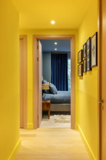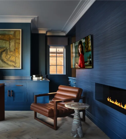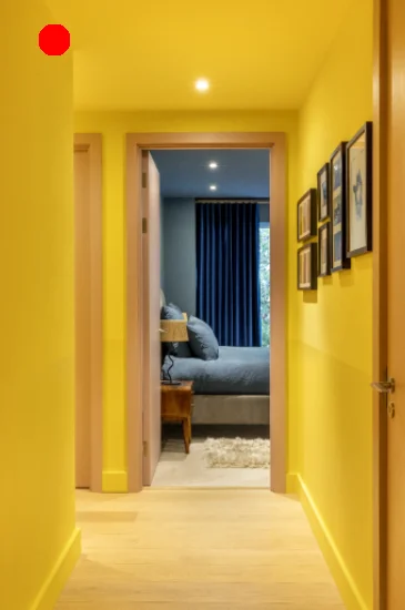


Finding the right paint colours can feel like a lot, but a well-considered colour scheme helps everything fall into place. Whether you’re drawn to soft neutrals, bold accents, or rich heritage tones, it’s about selecting colour combinations that suit your lighting, layout, and materials.
With Graphenstone’s carefully curated palette, inspired by English Heritage and designed for modern living, every shade tells a story. Each one is chosen to work beautifully in real homes, helping you choose with confidence and create a space that feels like yours.
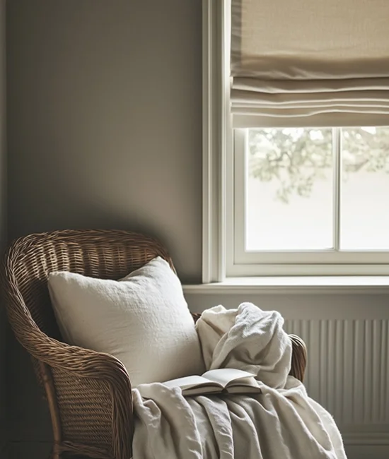
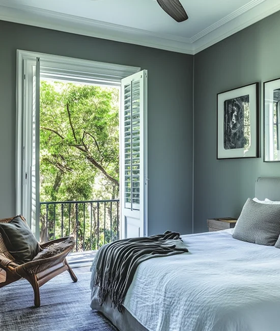
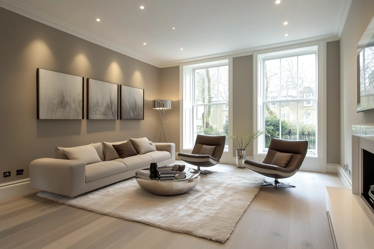
North-facing rooms receive cooler, subdued natural light, which can make spaces feel a little flat or shadowed. To introduce warmth and comfort, opt for tones with a gentle glow. Soft, warm neutrals like Cassium or Ivory help lift and brighten the space. Earthy tones such as Sandstone or Mocha add depth and a grounding quality. For a refined softness, try pastel shades like Blush or Delicate Pink, which reflect light beautifully and add subtle charm. Avoid cooler greys or sharp blues, as they can exaggerate the naturally cool tone of the light.
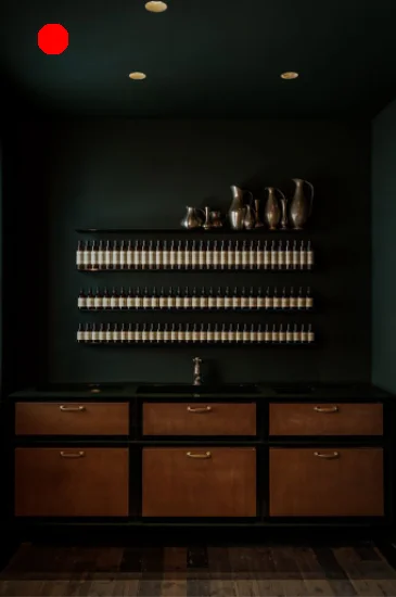
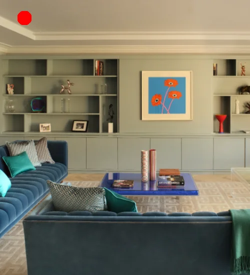
South-facing rooms benefit from abundant warm light, allowing more flexibility with colour choices. To balance the brightness, lean into cooler tones like Silver Moss or Fjord, which introduce calm and elegance. For a more playful scheme, soft yellows such as Naples Yellow or natural mid-tones like Maple bring vibrancy without overwhelming the space. Subtle neutrals like Ashen or Notebook reflect the sun without glare, maintaining a serene atmosphere. Rich colours can work too, but overly saturated hues may appear harsher under strong sunlight.
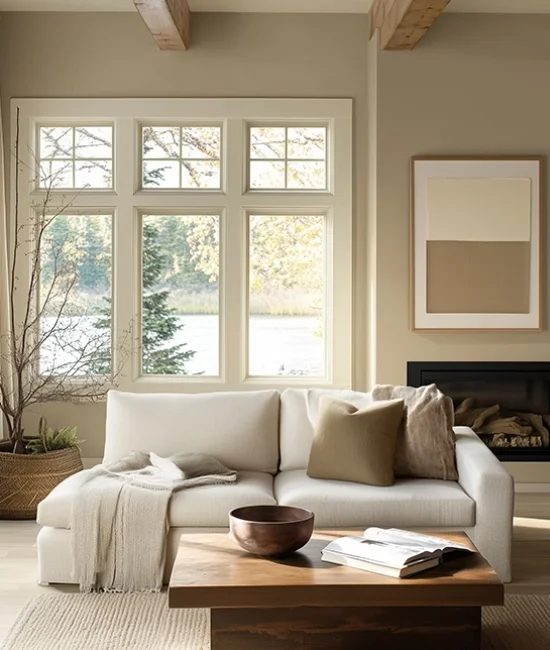
West-facing rooms bask in warm, golden light in the afternoon and evening, creating a rich and welcoming glow. To enhance this, consider warm neutrals like Warm Magnolia or Mid Sand, which respond beautifully to changing light. For added richness, colours such as Cornish Hearth or Harvest Clay bring depth and visual warmth. To keep things fresh earlier in the day, cooler tones like Celadon or Twilight offer a soft contrast. These combinations adapt elegantly with the light, ensuring your space feels cohesive from dawn to dusk.
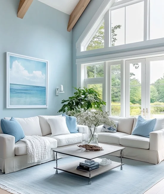
East-facing rooms glow with soft, morning light that cools by afternoon. To capture and enhance that early warmth, use light-reflective shades like Bleached Cream or Chinoiserie, which bring a fresh, sunny feel. As the day progresses, cooler accents like Celadon or Sea Foam maintain a gentle brightness. Pastel tones such as Soft Wisteria or Sweet Pea add softness and clarity, while mid-tone neutrals like Linwood or Ashen provide a grounding, timeless effect. Think about how your palette will evolve with the light to create balance and interest throughout the day.
THE COLOUR COLLECTION
A timeless palette inspired by heritage and sustainability
Graphenstone, in collaboration with English Heritage, proudly presents a new collection of 120 carefully curated colours. Rooted in history and guided by sustainability, the palette includes 24 exclusive shades inspired by some of England’s most iconic historic properties. From soft heritage tones to bold architectural hues, each colour brings together the richness of the past with the innovation of Graphenstone’s natural, mineral-based paints. This collection offers a thoughtful, timeless approach to colour—designed to elevate both traditional and contemporary spaces.
Discover the artistry of colour through Graphenstone’s exclusive collaborations. From the timeless elegance of the Heritage Collection to the curated palettes of renowned designers and cultural institutions, these unique ranges offer a wealth of inspiration. Whether recreating historic interiors or crafting contemporary spaces, these collections make selecting the perfect shade a journey of creativity and sophistication.
Archive Collection
A selection of 60 colours from our previous range will be archived as part of our new collection. While these shades will no longer appear on the physical colour card, they remain available to view and order online. From trusted neutrals to deeper heritage tones, these archived colours continue to offer timeless possibilities for both classic and modern interiors.
Heritage Collection
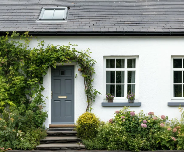
The Heritage Collection pays homage to the beauty of historic architecture with a range of shades perfect for heritage properties, lime renders, and traditional finishes. These colours evoke a sense of timeless charm while supporting the preservation of architectural integrity.
Michelle Ogundehin Collection
The Michelle Ogundehin x Graphenstone palette combines soothing, harmonious shades designed to enhance well-being. This versatile collection ensures every colour works effortlessly together, creating cohesive, balanced spaces that promote a sense of serenity and comfort.
Ashmolean Museum Collection
Inspired by treasures from the Ashmolean Museum, this exclusive collection features 16 iconic colours rooted in art and history. Each shade tells a story, making it the ideal choice for adding cultural depth and sophistication to your home.
Tim Gosling Collection
The Restoration Chateau Collection, curated by Tim Gosling, celebrates the magic of historical colour. Inspired by French chateau archives, this range offers timeless elegance with shades perfect for both restoration and contemporary reinterpretation.
Kate Watson-Smyth Collection
A collaboration with Kate Watson-Smyth, of ‘Mad About The House’ fame, the Italian Collection combines the romantic tones of Italy with the softer hues of the British countryside. These 12 harmonious shades offer endless possibilities for creating warm, inviting interiors.
Rose Uniacke Collection
Rose Uniacke’s refined palette features a range of thoughtful, harmonious colours designed for sophisticated interiors. This collection, inspired by her signature aesthetic, pairs beautifully with her fabric range and complements modern and traditional homes alike.
Royal Ballet and Opera Collection
The Royal Ballet and Opera Colour Collection brings the artistry of the stage to your walls. Inspired by four iconic productions, each phase offers colours that capture the drama and elegance of the performances, blending culture with design.
Howes & Landino Collection
The Couture Collection by Howes & Landino showcases 30 luxurious shades, each named after a fabric. This collaboration celebrates Graphenstone’s commitment to sustainability while offering a palette that exudes elegance, texture, and visual intrigue.


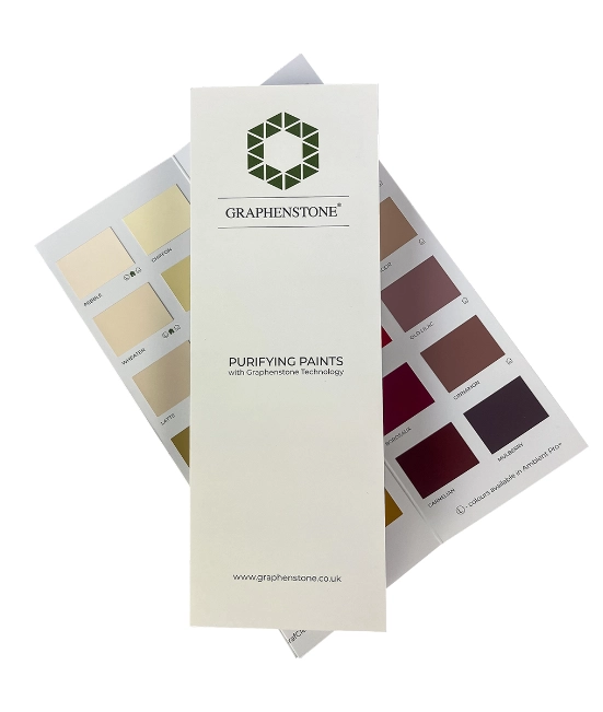
Graphenstone’s Peel and Stick Samples make choosing the perfect colour effortless. These repositionable swatches allow you to test colours directly on walls, ceilings, or furniture, observing how they interact with light and surrounding elements. By moving the samples around your space, you can explore how each shade evolves under different lighting conditions throughout the day. This practical tool simplifies the decision-making process, ensuring you achieve a colour palette that perfectly complements your home’s unique style and atmosphere.

Graphenstone’s 100ml Sample Pots let you experience the transformative power of colour firsthand. Apply the paint directly to your walls or onto a test board to see how each shade interacts with your room’s lighting and design elements. Sample pots provide the flexibility to experiment with multiple colours and finishes, allowing you to confidently decide on the perfect palette for your space. This hands-on approach ensures your final choice harmonises beautifully with your interior or exterior design vision.
- Understand Natural Light
The direction of natural light significantly affects how colours appear. Warm tones brighten north-facing rooms, while cool shades soften the intensity of south-facing spaces. Observe your room’s light at different times of the day to guide your choice. - Match Colour to Mood
Consider the atmosphere you want to create. Soft pastels promote relaxation, bold hues inspire energy, and neutral shades provide timeless elegance. Choose colours that evoke the desired emotional response for each space. - Test Before Committing
Always test colours in your space with sample swatches or Peel & Stick samples. View them in natural and artificial lighting to ensure they complement the room’s features and furnishings. - Coordinate with Existing Features
Harmonize your colour choices with existing furniture, flooring, and architectural elements. Warm woods pair well with earthy tones like Wheaten, while cool greys like Pigeon enhance modern finishes like steel or glass. - Use Colour to Enhance Space
Lighter shades like Alpine or Porcelaine can make small rooms feel larger, while deeper tones like Brunswick add depth and intimacy to larger spaces. Play with contrasts to highlight specific areas or features.
Light profoundly impacts how colours are perceived, transforming their tone and intensity throughout the day. Natural light from different directions can warm or cool a shade, while artificial lighting alters its hue entirely. North-facing rooms often enhance cooler tones, while south-facing spaces amplify warmth. Similarly, morning and evening light in east and west-facing rooms creates dynamic changes in a room’s atmosphere. Testing colours under various lighting conditions ensures your chosen palette complements the space at every hour, creating a harmonious and balanced environment.