

We are delighted to be the Paint Partner of the Eye of the Collector exhibition. Here we interview its founder, Nazy Vassegh, who offers her vision and experiences that shaped this event.
How to use dado rails in modern interiors
Photography by Daniel Ball. Colour Styling by Betsy Smith Spaces.
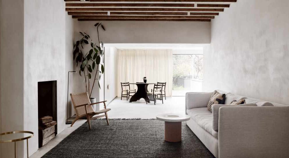
There’s renewed interest in architectural detailing. Skirting boards, ceiling roses, and now dado rails are making their way back into design conversations. Once used to protect walls from chairs, these low-set lines are being reimagined for what they bring visually: proportion, balance, and a clear break for colour and material. Far from a period throwback, they’re now used with intent, supporting colour blocking, shaping open spaces, and adding definition to the simplest of schemes. Colour choices are key to this revival, with heritage-inspired palettes, such as the 24 exclusive shades in our English Heritage Colour Collection, offering a timeless foundation for both modern and traditional interiors.
Read on for modern dado rail ideas, colour pairings, and how to make them work in today’s interiors.
Drawing the line: dado and picture rails explained
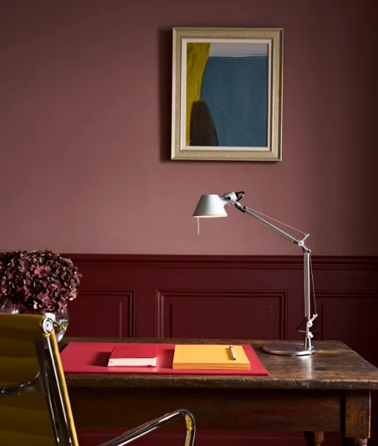
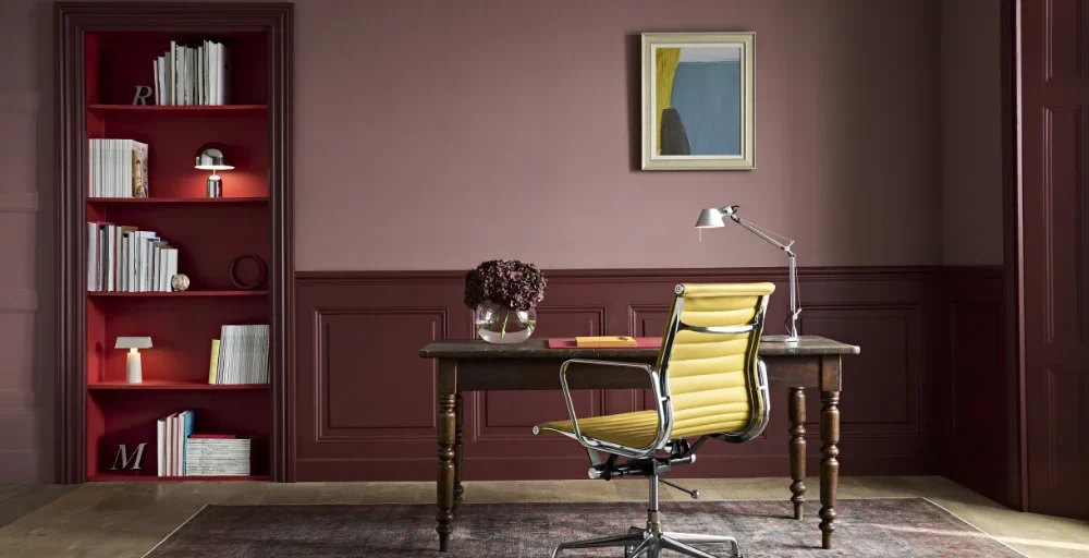
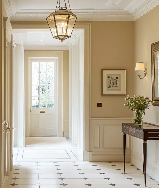
Dado rails, typically positioned 75–120cm from the floor, were introduced in Georgian homes to protect plaster walls from furniture. By the Victorian period, they took on a more decorative role, dividing lower wall sections and guiding colour and panelling schemes.
Picture rails, set just below the ceiling, became popular in Edwardian interiors as a way to hang artwork without damaging plaster. Today, both rails are used to structure colour, define spaces, and add architectural clarity to walls across both traditional and contemporary settings.
Wall: Michelle Ogunedhin Range – Easy Green | Panelling and Dado Rail: Dirty Sage
Note: Understanding the distinction allows each to be used purposefully—dado rails help ground a room, while picture rails draw the eye upward. Just be mindful of placement: dado rails that sit too high can make a space feel top-heavy; picture rails set too low can interrupt the natural flow of the wall.
Wall painting ideas using dado rails
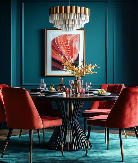
Dado rails offer a natural point to separate colour and finish. Whether you’re looking to introduce contrast or simply define lower wall sections, they’re an effective tool for colour blocking walls without overwhelming the space.
Design approaches that work:
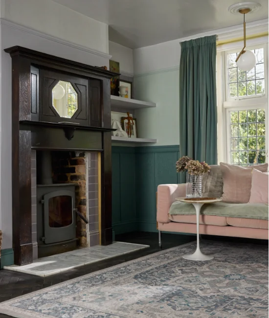
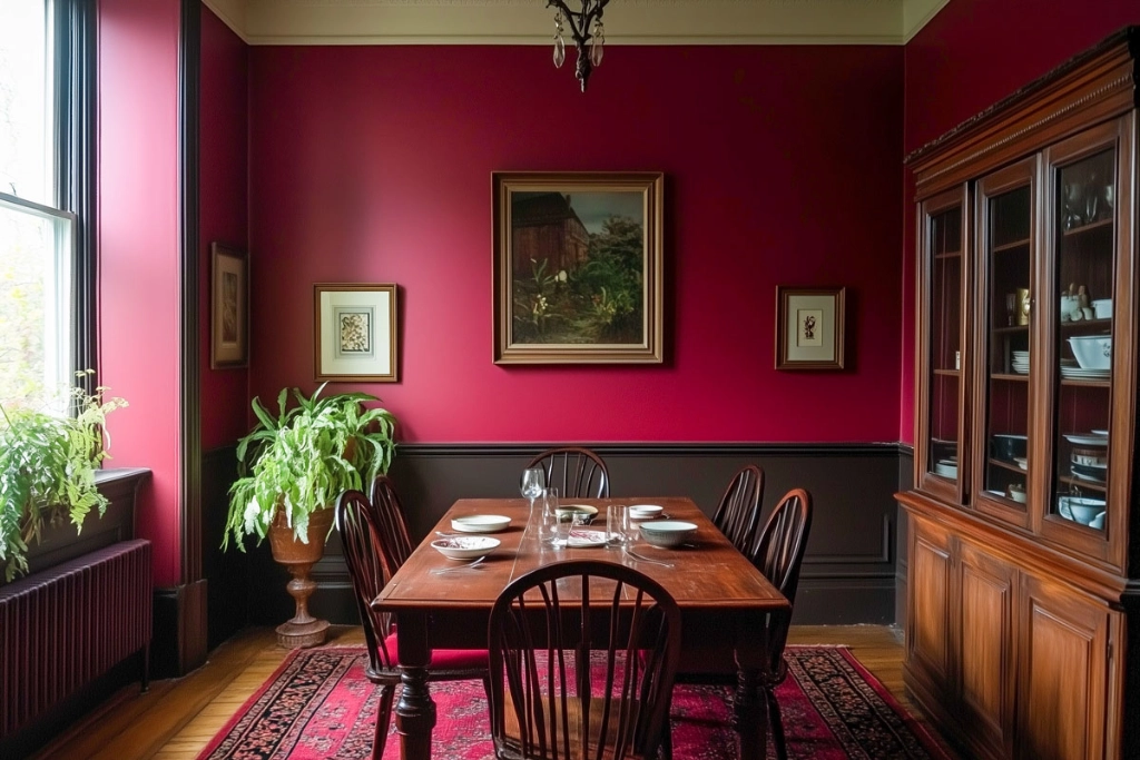
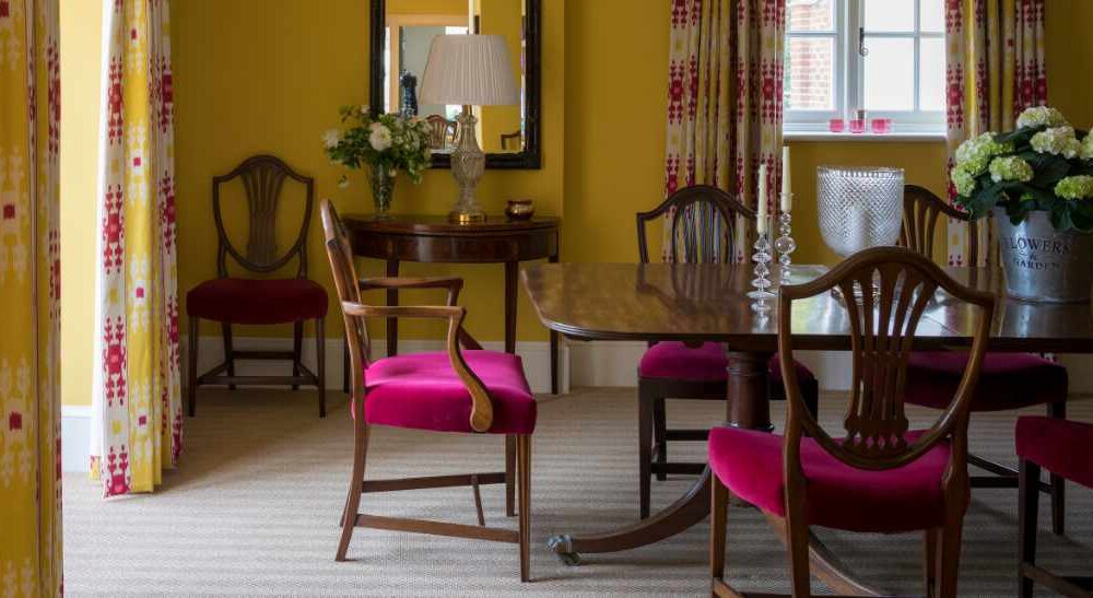
Contrast and Grounding: Anchor the lower section with a darker tone, such as Cypress, Starry Night, or Chestnut, and lift the space above with lighter shades, such as Putty or Ashen.
Tone-on-Tone: Pair similar shades for a soft, layered effect, ideal in bedrooms or quieter spaces. Try Flax and Cassium or Antique Pink and Truffle.
Minimalist Match: Paint the rail and wall in the same colour for a clean, seamless look. Calm neutrals like Pavilion, Cotswold Stone, or Ashen keep the space feeling open, balanced, and considered.
Accent Detail: Use a contrasting shade on the rail to create a crisp, modern line. Pair Ashen with Porpoise for soft definition, or try Carrara White or Cumulus with London Evening to anchor light walls with a warm charcoal edge.
Graphenstone Paint: Bordeaux
How to paint dado rails
Painting dado rails is all about clean lines and choosing the right finish for lasting results. Start by masking above and below the rail with painter’s tape to ensure a sharp edge. Work from top to bottom: paint the upper wall first, then the rail, then the section below, allowing each area to dry fully before moving on.
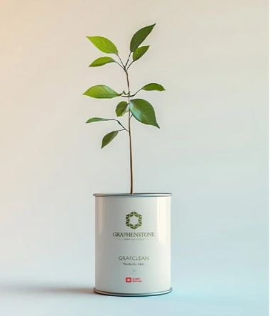
We recommend GrafClean Eggshell for the rail. Its soft 15% sheen and wipeable, durable surface make it well suited to woodwork and high-traffic areas. Made with natural minerals and sustainably sourced raw materials, this premium interior paint offers excellent coverage, low sheen, and a smooth, long-lasting finish.
Graphenstone Paint: Cotswold Stone
Graphenstone Paint: Cerulean
Curated colour pairings
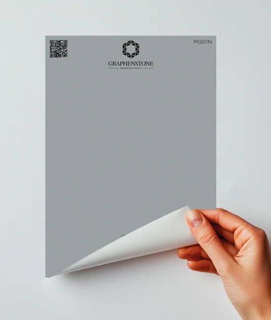
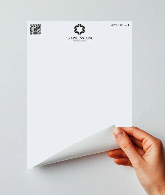
Not sure where to begin? One way to test your colour combinations is with our sustainable Peel & Stick Colour Samples—a simple, commitment-free way to try shades at home. Here are a few dado rail colour schemes we love.
Calm and Classic: Pigeon below with Silver Birch for that fresh-yet-grounded feel.
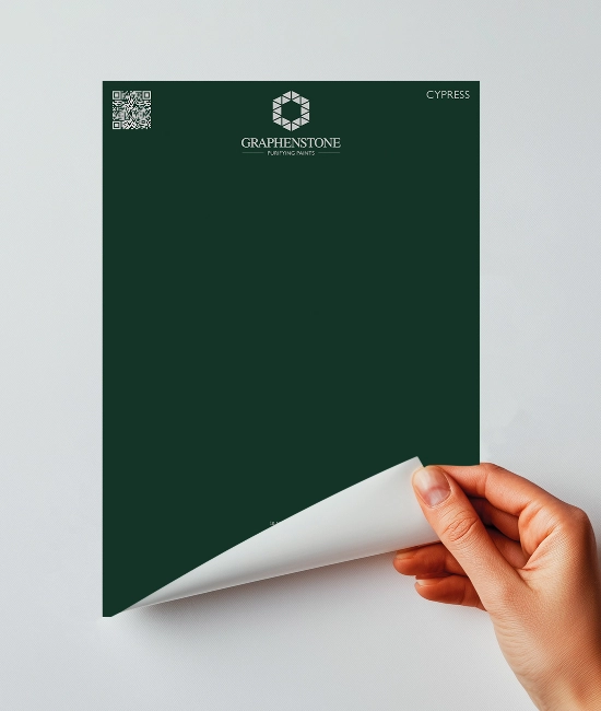
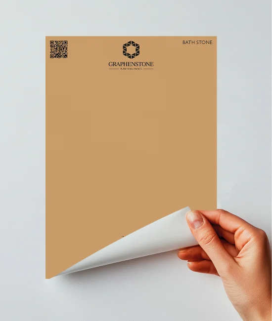
Dramatic Contrast: Cypress and Bath Stone, if you like a bit of drama.
Design that lasts
Graphenstone’s mineral-based paints are made without added microplastics, offering clean, sustainable colour that supports healthier interiors. Suitable for heritage properties, modern homes, and even the most sensitive spaces, every finish is designed with both performance and planet in mind.
Dado and picture rails provide a simple way to structure colour with intention. Explore finish pairings in our Colour Inspiration Guide or visualise combinations in your own space with the Room Visualiser.
Graphenstone Paints is proud to be in partnership with English Heritage, the charity that cares for more than 400 of England’s most cherished historic sites. For every purchase made, a proportion of the proceeds will go to English Heritage and help to preserve more than 400 of the charity’s historic sites across the country.
Related Posts

Comments (0)